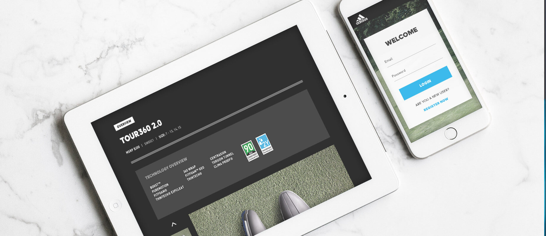
Employee Training Portal
We designed and built an online internal sales tool to help educate adidas Golf sales teams on company initiatives and future products to assist them to sell more effectively. We were challenged to build a tool that made the learning experience engaging and thorough, but with mitigating user fatigue.
-ROLE
Design
Art Direction
UX
Front-end Direction
-YEAR
2017
-TYPE OF PROJECT
Educational Tool (Responsive Website)
-ROLE
Design
Art Direction
UX
Front-end Direction
-YEAR
2017
-TYPE OF PROJECT
Educational Tool (Responsive Website)
Our strategy
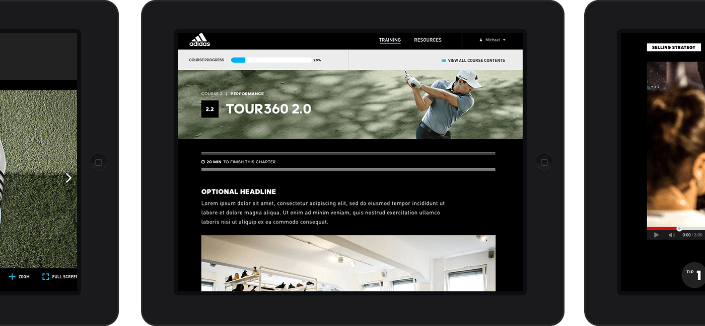
Keeping in mind that a tablet will be the most commonly used device, we took an approach of building responsive website highlighting product lines and brand video assets as the key driver for education. We did research on Learning Experience Design specifically, and following items are some of the suggested best practices we incorporated in our tool:
- Clearly defined learning objectives: We sent out a welcome email to the sales team to communicate the goal and purpose of this tool.
- Incorporate educational games and simulations: To keep users engaged, we incorporated quizzes at the end of each course, as well as interactive content tiles and components.
- People learn better when they perceive social presence: By teaming up with the adidas Golf team, we were able to provide instructional video with organization leaderships throughout the course.
- Summarize the content and bridge to the next activity: Before each course’s quiz starts, we provided a Key Takeaway page to help users recap what they have just learned.
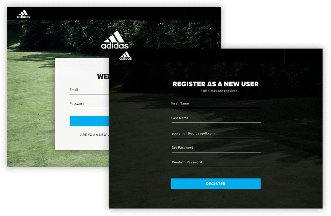
Each user is required to create an account so then admin can track on the course progression and quiz completion rate.
Each user is required to create an account so then admin can track on the course progression and quiz completion rate.
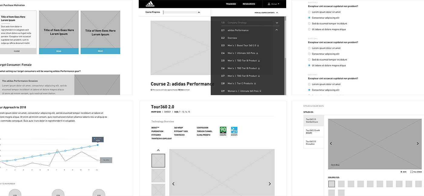
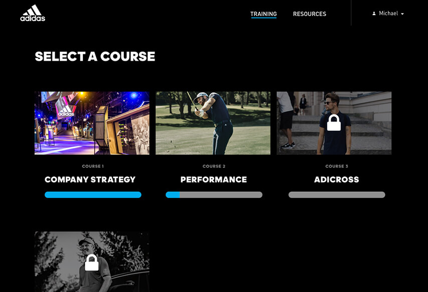
The training course was grouped together with learning topics. First, users will learn overall company strategy for the upcoming year, then learn about selling strategy for the specific product silo.
The training course was grouped together with learning topics. First, users will learn overall company strategy for the upcoming year, then learn about selling strategy for the specific product silo.
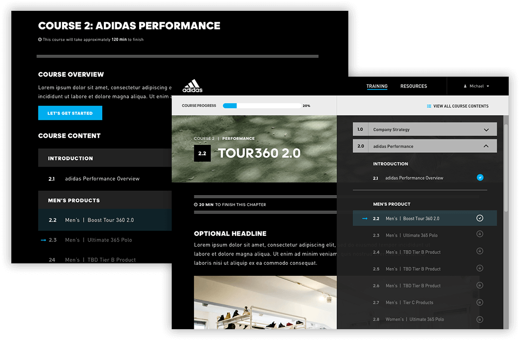
Interactive table of content. Visual guide for the user to understand where they are within a course. The progress bar helps the user visually understand how much more to go on this course. Also providing minutes to take per chapter to set a user expectation on reading length.
Interactive table of content. Visual guide for the user to understand where they are within a course. The progress bar helps the user visually understand how much more to go on this course. Also providing minutes to take per chapter to set a user expectation on reading length.
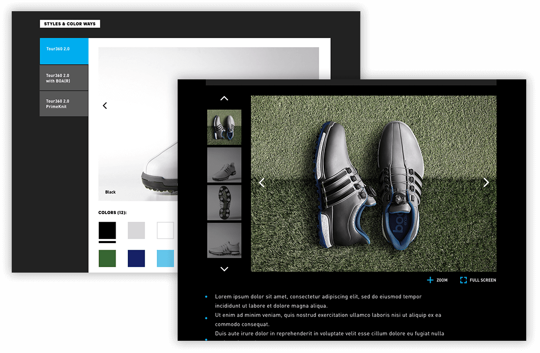
Organized technical product information in a digestible manner. Users can swipe, pinch and zoom to interact with images.
Organized technical product information in a digestible manner. Users can swipe, pinch and zoom to interact with images.
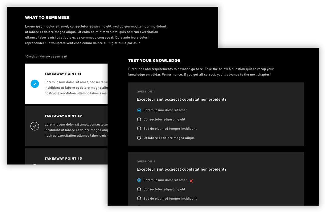
Each course provided a key takeaway chapter where a user can get a summary of the entire course before they jump into the quiz. Users are required to check off each key take away prior to advancing the chapter.
Each course provided a key takeaway chapter where a user can get a summary of the entire course before they jump into the quiz. Users are required to check off each key take away prior to advancing the chapter.
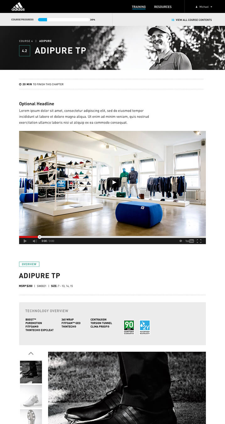
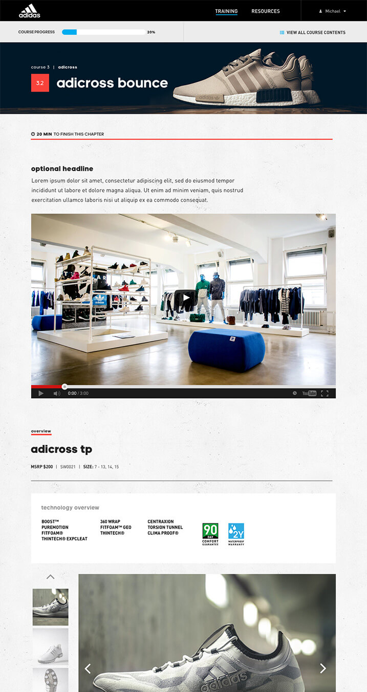
Established different sets of UI per product silo for a user to be able to digest course contents easily.
Results
Contract signed for 2018 version, and we will be expanding this experience to their Europe, Canada and Asia region of sales team.
“I spoke to a couple reps this morning who have received it. One actually completed it yesterday, took him about 3.5 hrs and he was very pleased with the content and functionality. Good news.”
—— U.S. Sales Director of adidas Golf
View More
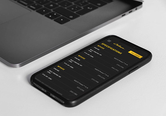
AGCO Challenger Website RedesignUI/UX, Website
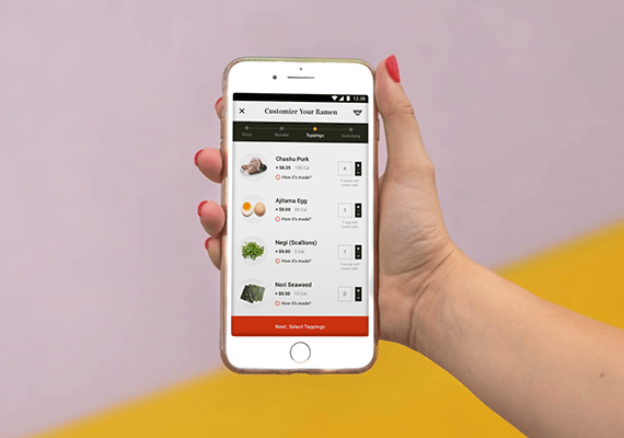
Adobe Live Ramen Ticketing AppUI/UX, Mobile App
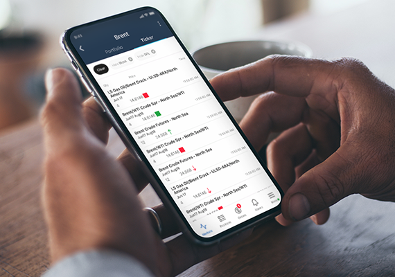
ICE MobileMobile UI/UX Design
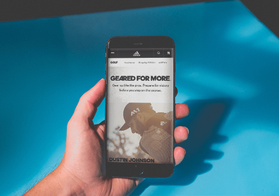
adidas.com MigrationUI/UX, Website Migration

UC San Diego Break Things Better CampaignUI/UX, Campaign Microsite
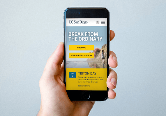
UC San Diego Main Website RedesignUI/UX, Website
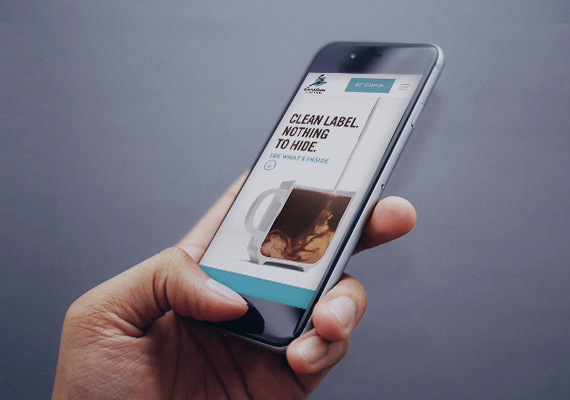
Caribou Coffee Clean Label CampaignUI/UX, Campaign Landing Page