
Clean Label
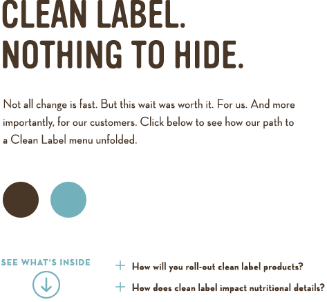
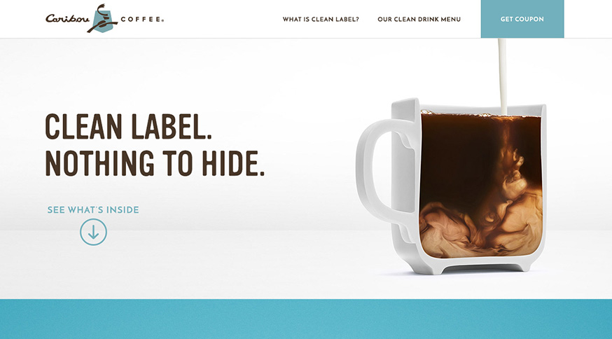
Caribou Coffee has set a Clean Label standard for making them the first national coffeehouse chain to offer beverages made with no added artificial ingredients. VITRO agency was to build a brand around Clean Label by engaging and educating them on what Clean Label means. Our digital department was tasked particularly to come up with design and strategy for the HTML static landing page which was an online destination for this entire campaign.
-ROLE
Design
UX
Content Strategy
Front-end Direction
-YEAR
2017
Visit Website
-ROLE
Design
UX
Content Strategy
Front-end Direction
-YEAR
2017
Visit Website
Landing Page Objectives
Engage with the content of Caribou’s commitment to Clean Label
+ Our success was measured with time spent on site and bounce rate- Educate on Clean Label at a product-level
+ Our success was measured with click behavior and user interaction on page - Incentivize drinks trial and push through to local store
+ Our success measured with goal conversion (how many users triggered the coupon) and click through rate (if they visited location page or main Caribou site)
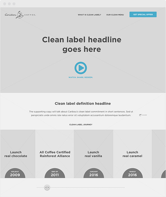
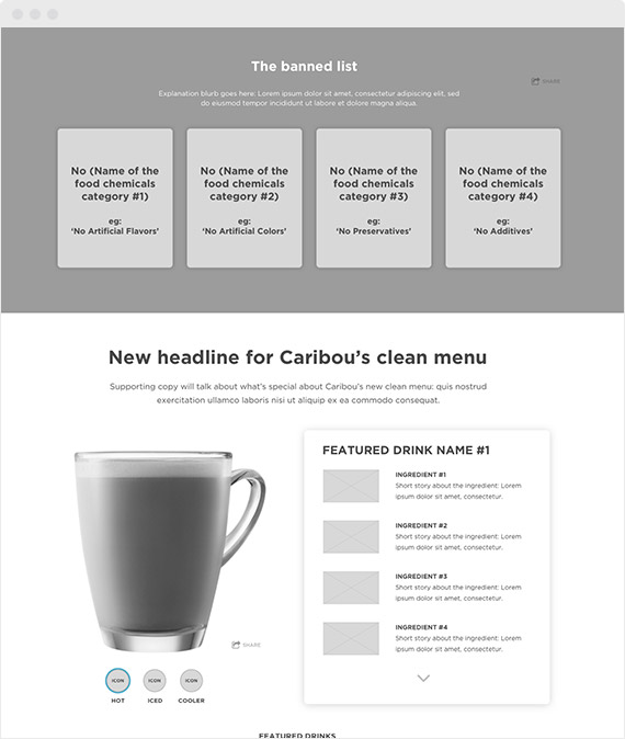
DESIGN

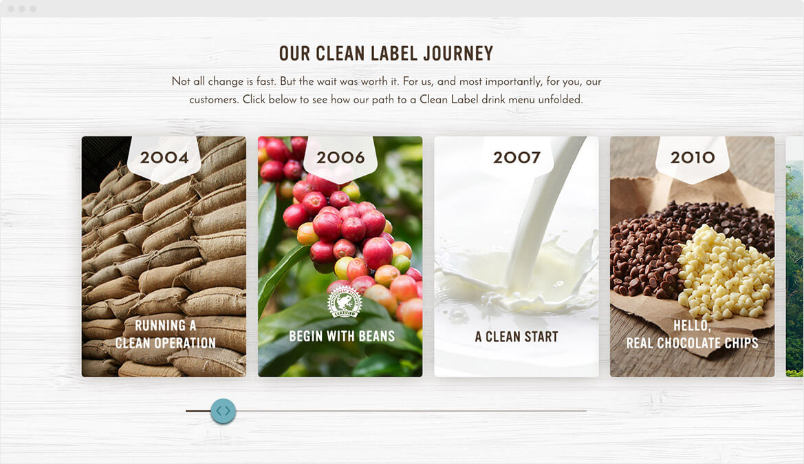
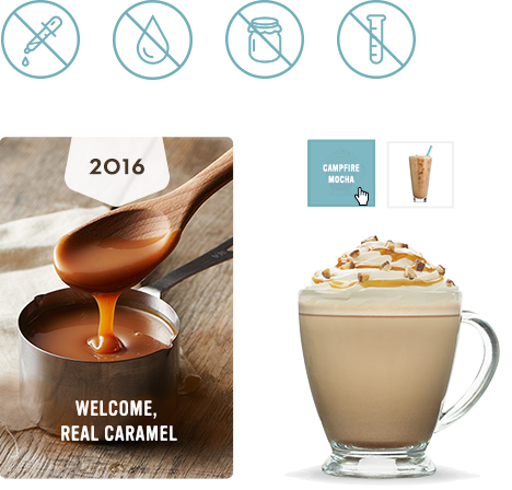
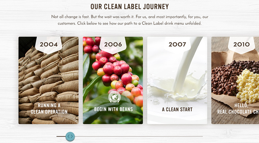
During the discovery, we found out that Cariou’s Clean Label movement had quite a history. They revisited their ingredients from coffee bean sourcing to caramel sauce. They truely care about the quality of products, and we wanted to make sure that site visitors get exposed to these untold stories.
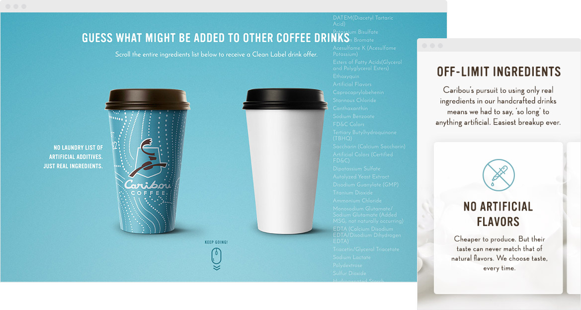
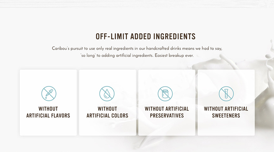
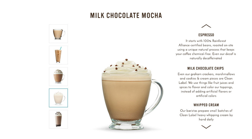
Our biggest challenge was how to keep visitors engaged with the contents. We have great stories but who really reads nowadays? So we came up the unique scroll jacking experience which let users interact with the list of artificial ingredients. This long list stays next to other company’s coffee and visually communicates that such large amount of bad ingredients could be used in non-Caribou coffee.
The fun dialogue is incorporated in both list and bouncy scroll mouse icon to keep this experience more interesting. Users will be rewarded by drink coupon upon a completion.
Design Approach
Our core audiences are 18-24 female so we took more warm, playful and personable design and copy approach.
Results and Key Metrics
Clients loved how the landing page design came out, so they decided to redirect people who connected to Caribou’s in-store wifi.
30 DAYS METRICS
was spent on page in average
drink coupons received
unique events occurred in total
View More
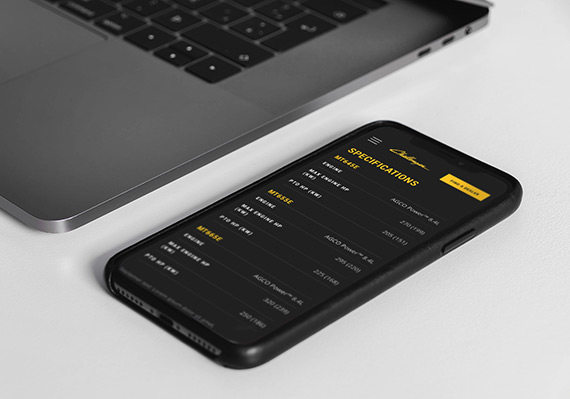
AGCO Challenger Website RedesignUI/UX, Website
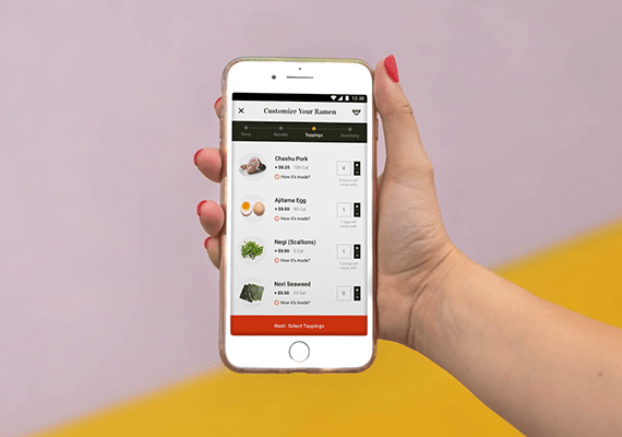
Adobe Live Ramen Ticketing AppUI/UX, Mobile App
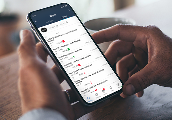
ICE MobileMobile UI/UX Design
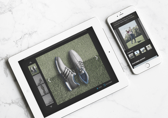
Employee Training PortalUI/UX, Educational Tool
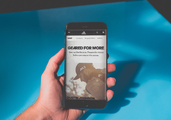
adidas.com MigrationUI/UX, Website Migration

UC San Diego Break Things Better CampaignUI/UX, Campaign Microsite
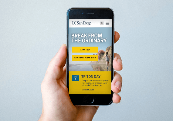
UC San Diego Main Website RedesignUI/UX, Website