AGCO Challenger Website Redesign
AGCO Challenger Website Redesign
Overview
Challenger is AGCO’s large-scale agricultural tractor brand for professional farmers. Challenger is a game changer. With its innovative technology, Challenger equipment is more versatile without sacrificing the power needed to manage agribusiness in the most time-effective, cost-efficient way.
ROLE
UI/UX Designn
UX Research
Content Strategy
Technical Documentation
Front-end Direction
YEAR
2018
ROLE
UI/UX Designn
UX Research
Content Strategy
Technical Documentation
Front-end Direction
YEAR
2018
Challenges
As a brand with a strong reputation for power, durability, and reliability, our challenge was to re-identify the website’s branding to be techy, smart and precise while developing a better user experience and comprehensive design system.
Additionally, we were tasked to create a centralized module library, because the client’s vision was to consolidate all AGCO brand websites under AEM and start sharing modules including the ones we build during this web-redesign.
Our Process
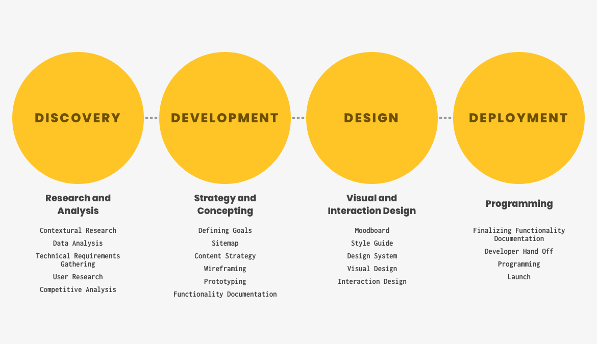
As a lead UI/UX designer, I was involved in the whole process.
My Role
Focused on UX research (stakeholder interviewing, card sorting exercise, identifying users’ needs and problems, competitive analysis), gathered technical requirements while understanding current AEM modules, developed wireframes and prototype, established new branding and UI system, and documented functionality to keep our team, client and development vendor on the same page throughout the process.
1. Discovery Phase
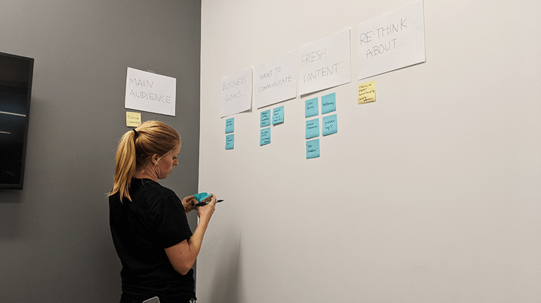
Gathering insights and contextual research
We interviewed business stakeholders (marketing managers, web managers, product managers, customer service vendors) to gather insights on current business issues, pain points, and their future visions.
In order to digest and share all the information, we wrote everything down on sticky notes and sorted by themes.
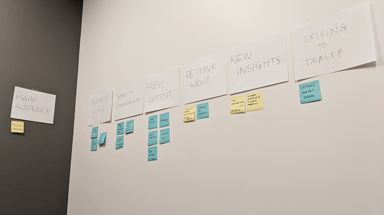
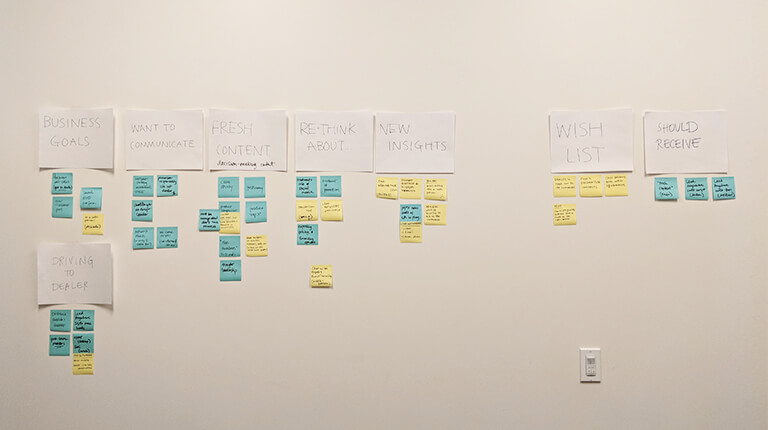
The most common business struggles in regards to their website (top 3)
- The website isn’t sending purchase-ready leads to Challenger dealerships. Business wants dealers to spend their time and energy to close the deals, not to answer basic Q&A.
- Customers aren’t fully understanding why Challenger is better. They just look at the price and specs, so they aren’t convinced that Challenger is the best option.
- Need mobile-friendly experience to allow potential customers to engage with website more.
Based on these issues, we created assumptions on why users behave in certain manners and then began crafting questions to customers and dealers to confirm if our assumptions were accurate. We conducted both phone interviews and an on-site surveys.
The questions we asked include:
- Does Challenger stand out compared to your other option? What information do you need to be convinced that Challenger is better?
- When and how do you conduct research when you are shopping?
- Who do you trust more? The brand? Dealer? Or your neighbor farmers?
Opportunities we discovered during the user research (Only listing a few that stood out):
- Specs don’t tell the story. Including scientific proof and stories to data point is key to making Challenger advantages come to life.
- Make chat functionality accessible so that users can connect with customer service earlier on their journey.
- Consider pushing “Get a quote” CTA rather than “Find a Dealer” to mitigate purchasing pressure.
- Create a content hub for manuals and tips. Customers want to know that they will have full support post-purchase.
Then, we created some UX artifacts to keep the team aligned with the findings.
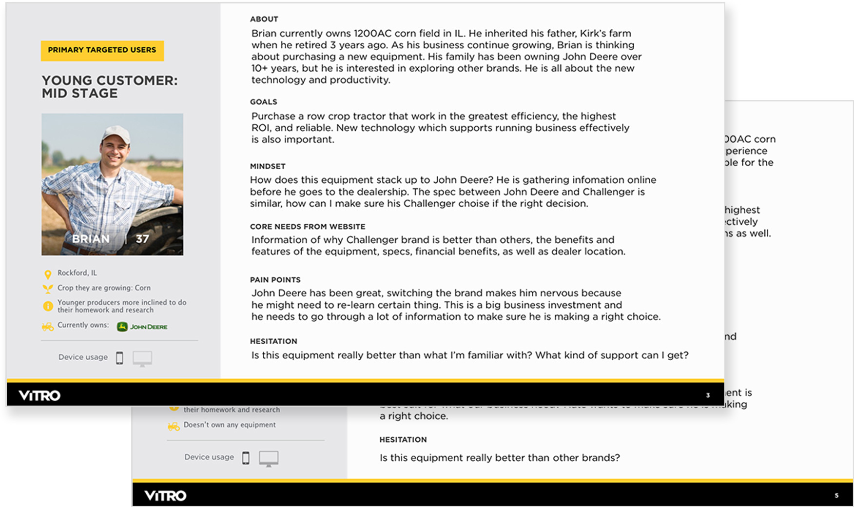
Persona
The brand’s target audience is young professional farmers who are more tech-savvy and ready to try new things. During the research, we found that this audience could be divided into multiple personas because of their purchasing stages.
- Early - “I think we need a new tractor. But not sure which brand and what types of equipment we should get.”
- Mid - “I need a piece of equipment that does XYZ. I like Challenger but also considering other brands. What’s the best way to compare them side by side?”
- Late - “I’m ready to purchase Challenger. What’s my financial option? Is there any deal going on?”
Empathy Mapping
A lot of thinking is going on when our customers shop around +$300K equipment. We created an empathy map to understand what our customers need in a certain purchasing stage. I followed NN/G’s template to create empathy maps.
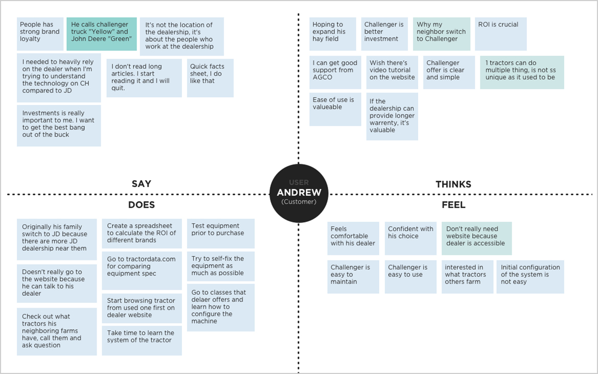
Digital version of the empathy map
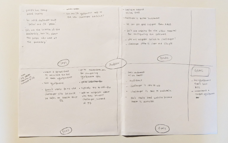
Initial sketch of the empathy map
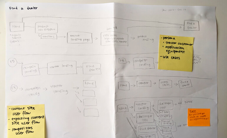
Website Customer Journey
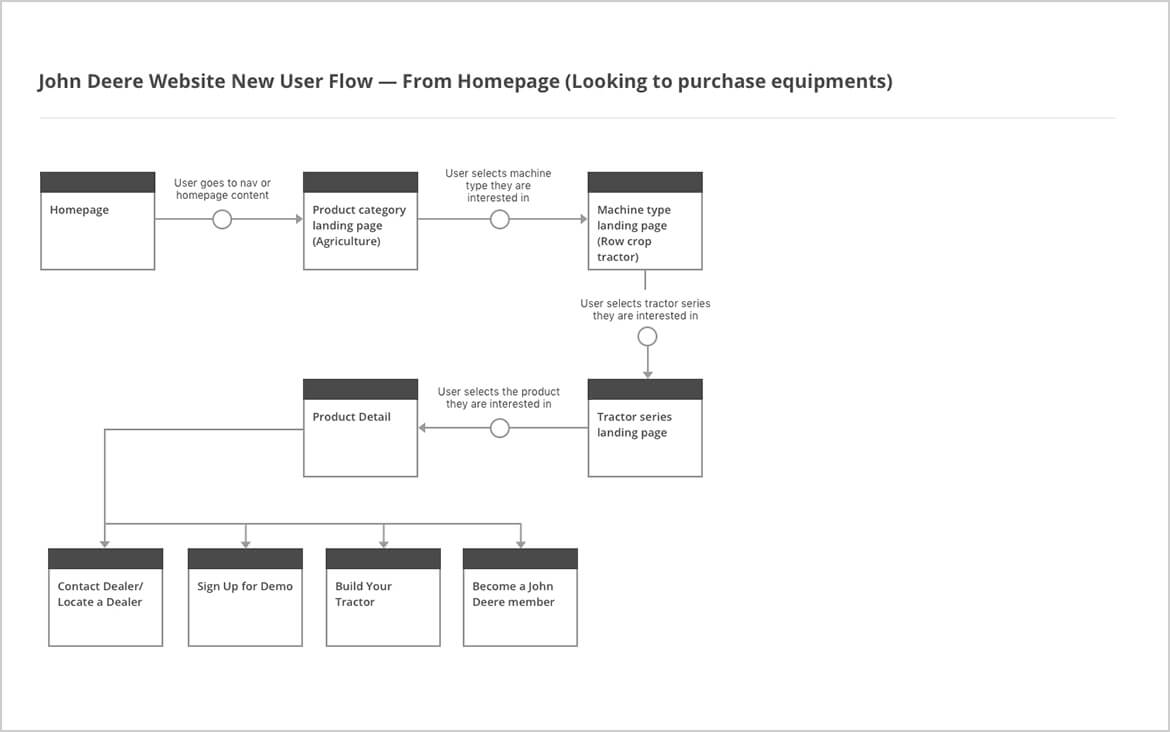
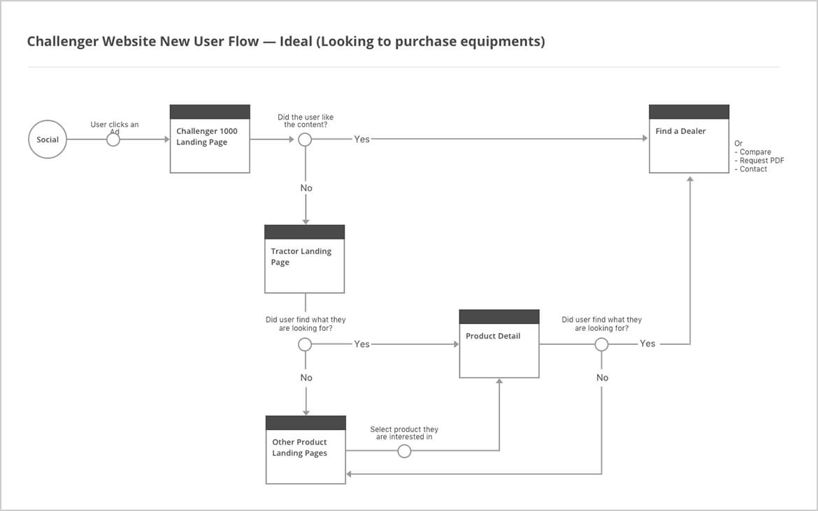
By taking GA data, customer service vendor’s data, and manually going through the website, I created a current customer journey to understand how users are going through the site. I also created a competitor’s journey to see how they are doing differently. After this exercise, I created an ideal customer journey to guide site architecture and content strategy.
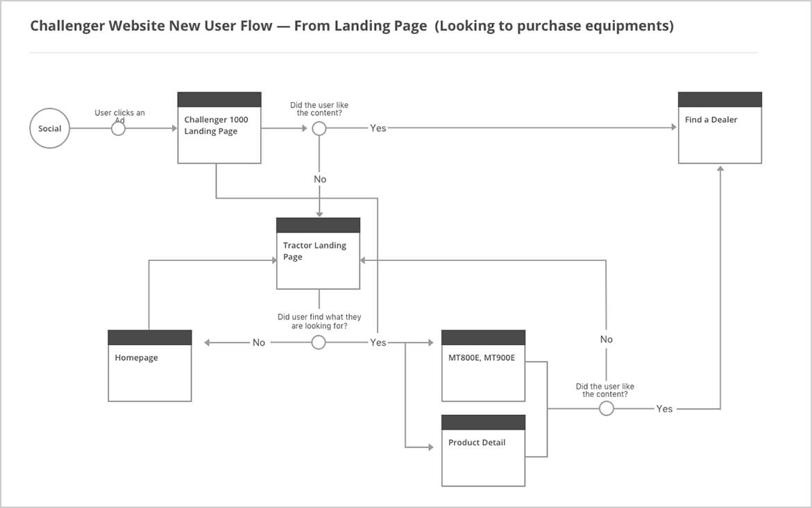
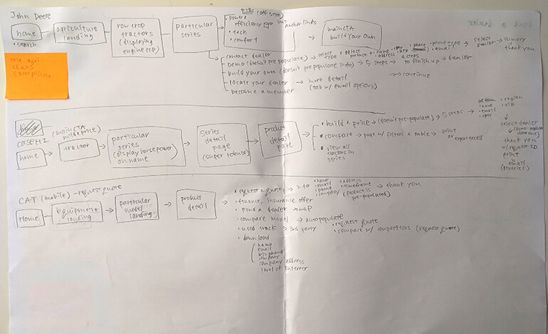
Competitive and Comparative Analysis
Upon understanding the current website experience and issues, we researched direct competitors’ websites to learn what’s going on and how their experience is different from Challenger.
To seek out other experience inspiration, we also analyzed companies whose websites function similar to the Challenger site (eg: automobile industry — customers cannot purchase products on the website but it drives traffic to dealerships).
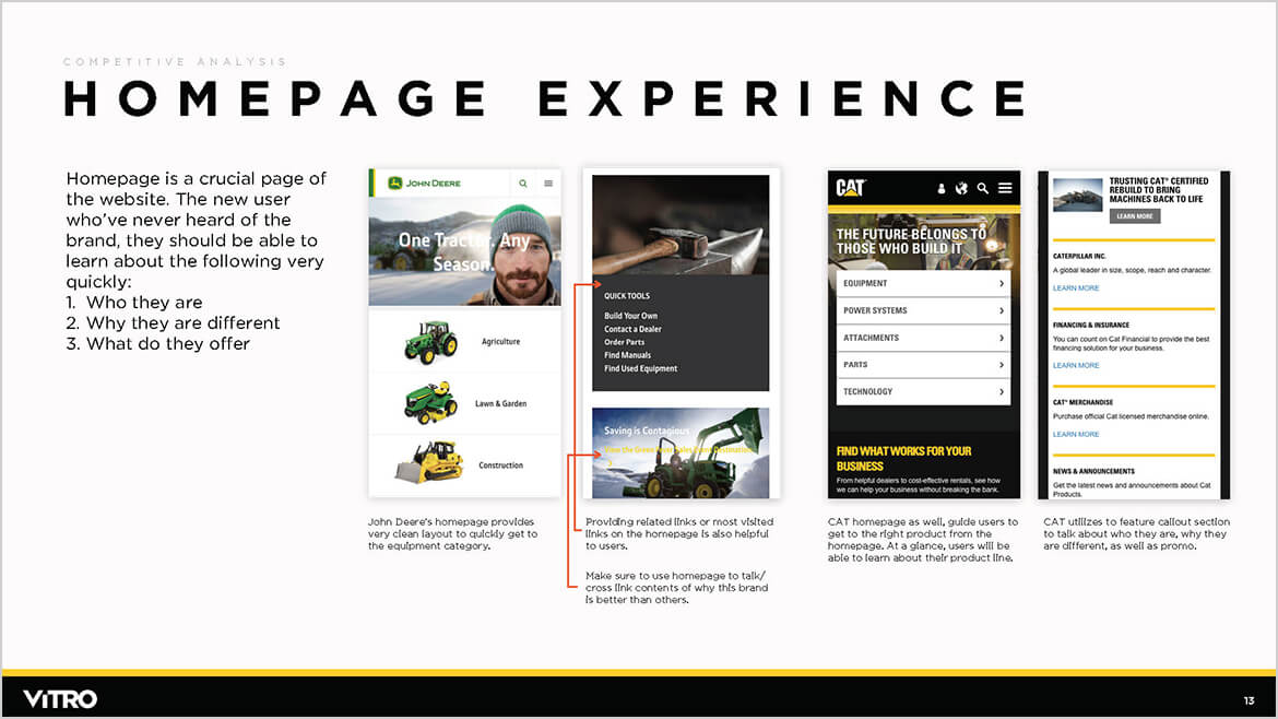
Direct competitors John Deere and Caterpillar both have a huge amount of equipment information. However, contents are displayed and organized in systematic manners for users to digest easily.
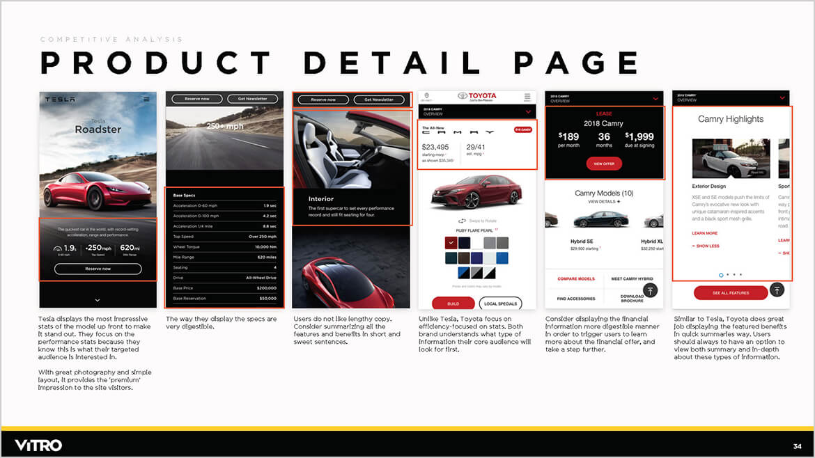
Toyota and Tesla both have a significant web presence. Their web experience, content hierarchy, and organization are great so we took experience inspiration from them. Tesla especially had great high-end techy branding, so this research ended up becoming my visual inspiration as well.
Understanding Technical Requirements
We gathered information about existing modules, functionalities and data structure by working with dev vendor and client. This gave me a framework on what’s possible and not, how to structure new modules, as well as module naming conventions.
Going through the clietn's AEM module documentation
Going through the dev vendor's module documentation to follow the functionality and naming convention
Final Discovery Presentation
We created the discovery presentation documents which contain all research, analysis and findings. We also defined the core website strategy and goals in this presentation.
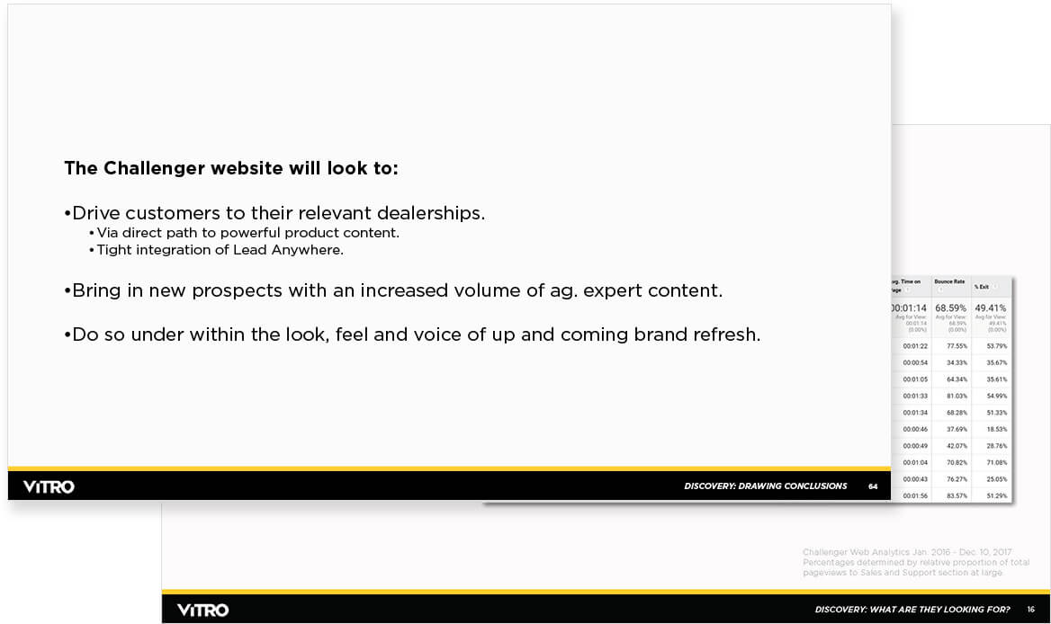
Website Goals
- Better mobile user experience
- Publish contents around how Challenger stacks up vs. competitors
- Product detail page must establish information findability. Elevate the content in demand
- Establish a defined path for different purchasing stage users to take an action throughout the site
- Customer service/Live chat functionality should be accessible anytime
2. Development Phase
Information Architecture
Upon understanding current issues and customers’ needs, we developed a sitemap. Our strategy focused on providing a clear path to the equipment detail pages, and a content hub of why Challenger is different.
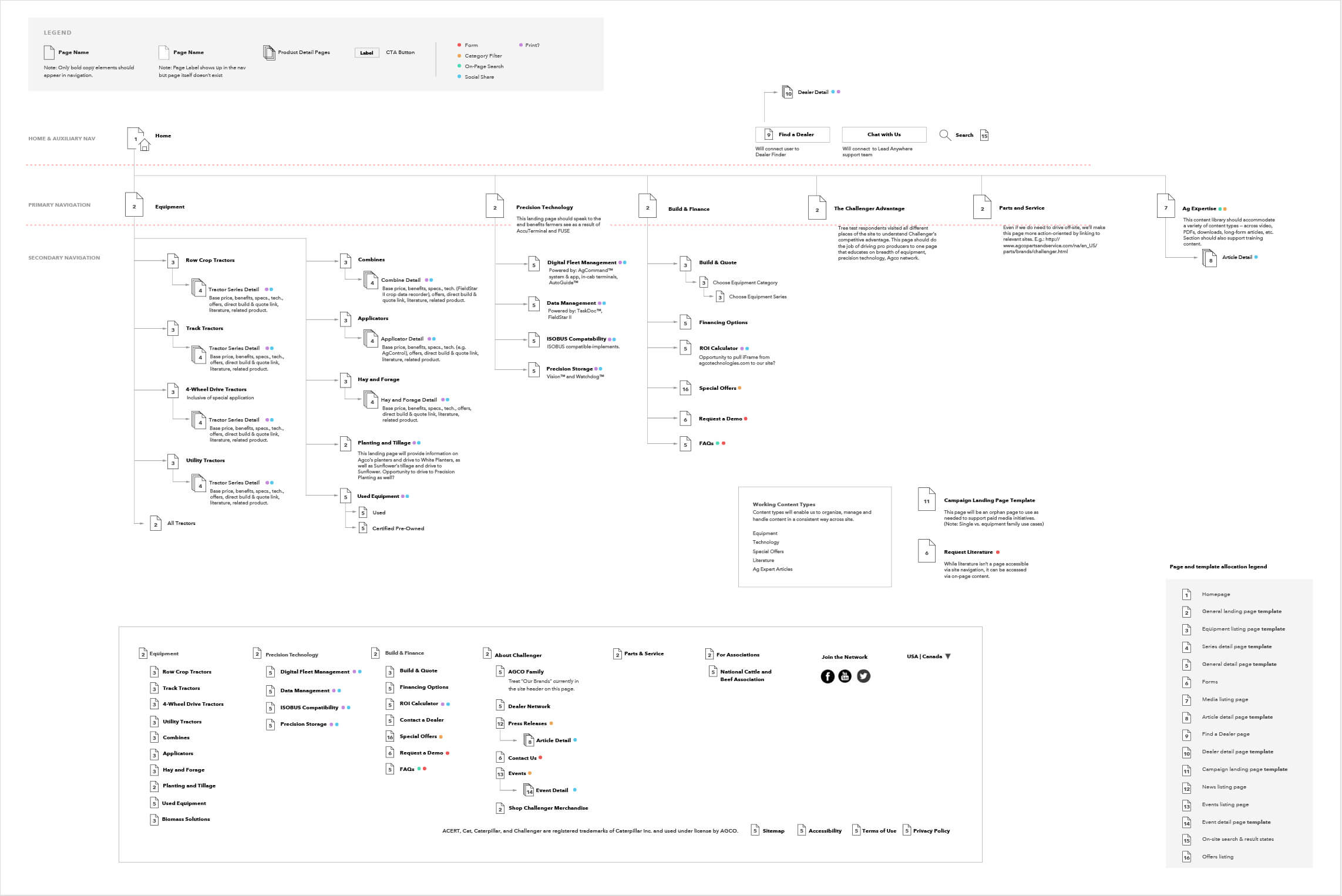
At this stage, we also started thinking about which page could share the template and where the specific widgets should live
Then, we ran a tree test by using Screaming Frog to the current 30 site users to evaluate if they can easily find the right content.
Below are some of the example questions that we asked:
- Imagine you have a neighbor with a yellow tractor and want to understand what's so great about Challenger. You've learned a bit from your neighbors, but also visit the Challenger website. Where do you navigate?
- Imagine you are in the market for Challenger's MT700, and want to understand how it compares to Deere's option. Where would you navigate?
- You're looking to purchase a tractor in the next few months and want to talk to someone at Challenger about the equipment options you'd have to determine the best way forward. Where do you navigate?
Insights
- For Q1, testers went to various places such as About Challenger, FAQ, and Equipment Detail page. —> Consider creating one page with a clear label like “Why Choose Challenger?”
- For Q2, users couldn’t get to MT700 page directly. They clicked all over and finally got to the page. —> Consider exposing the product name in the nav or restructure the product categories.
- For Q3, we wanted the testers to go to “Chat with Us” to connect with customer service; however, many of them went to “Contact a Dealer”. —> We don’t want unqualified leads to contact dealers, so consider changing the label to “Find a Dealer” and make the “Chat with Us” button very prominent once we design the page.
After examining the test results, we revised the sitemap to below.
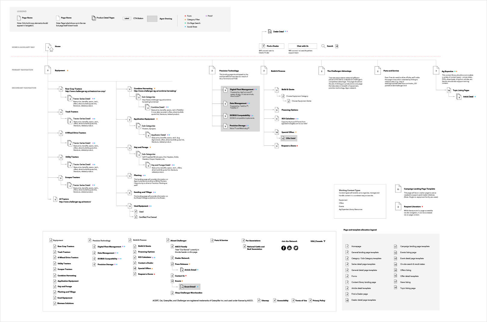
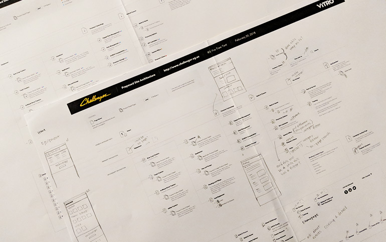
Reviewing and scrabbing ideas on work-in-progress sitemap
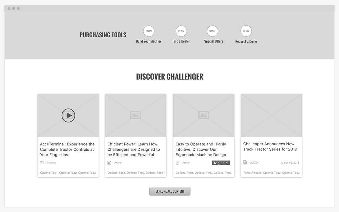
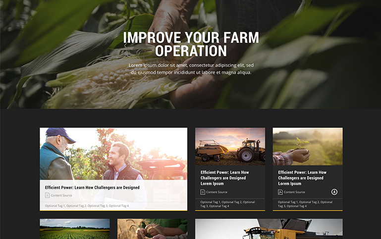
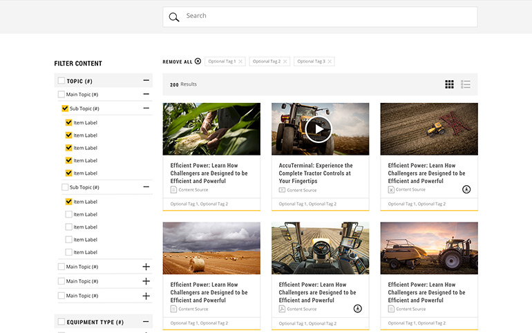
Content Outline
After developing a sitemap, we created documentation that shows what kind of content lives where. This acted as the checklist when I wireframe the page experience.
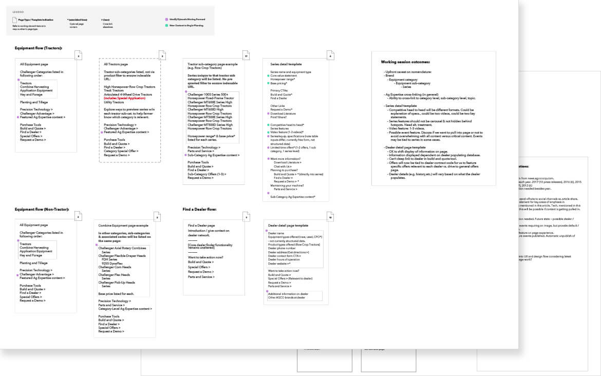
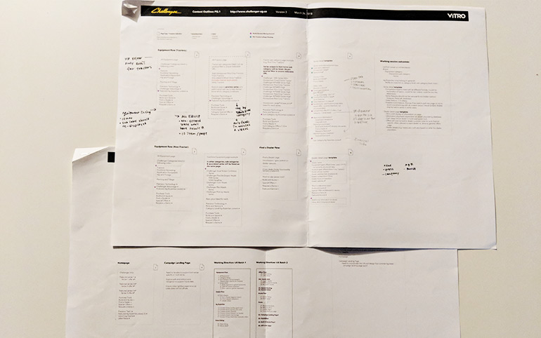
Reviewing content outline with team
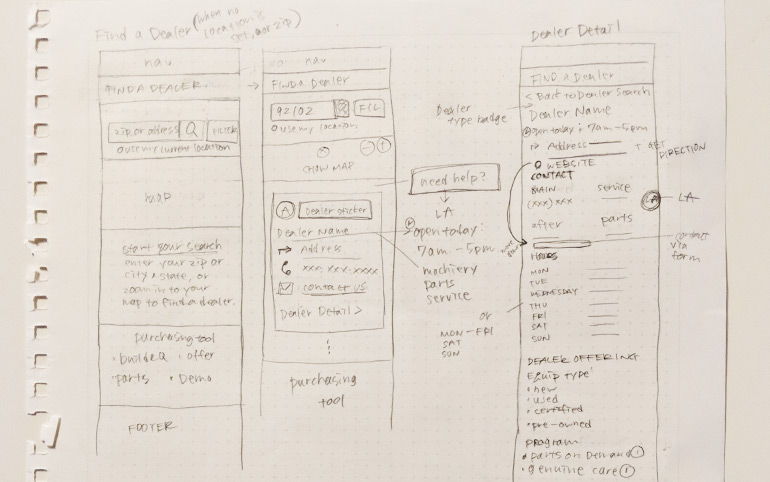
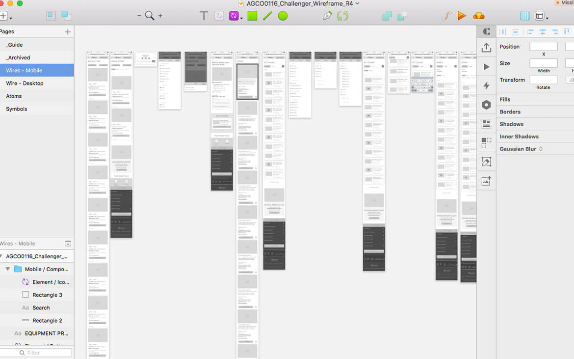
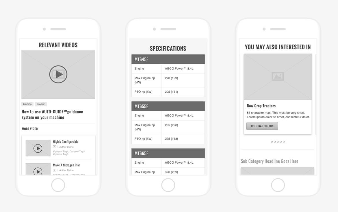
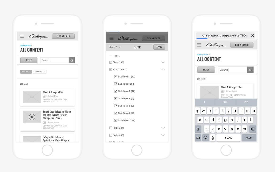
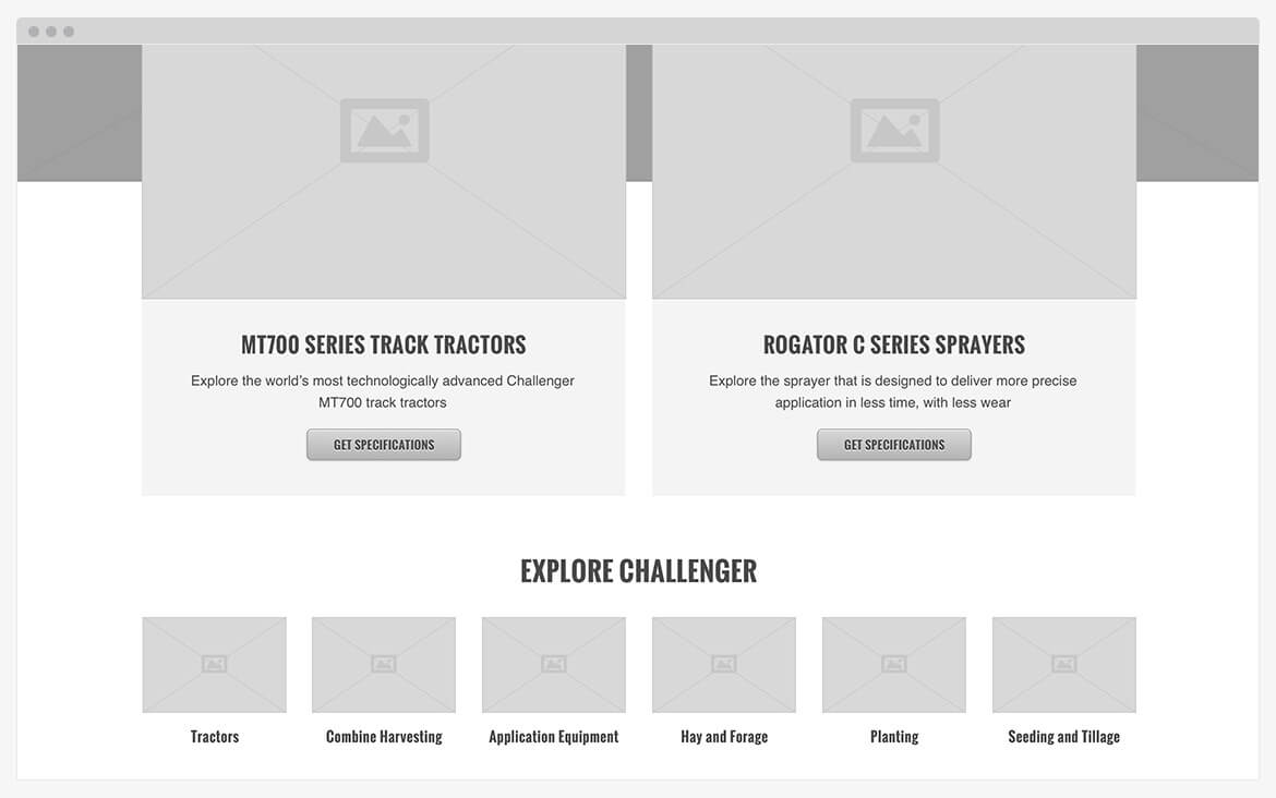
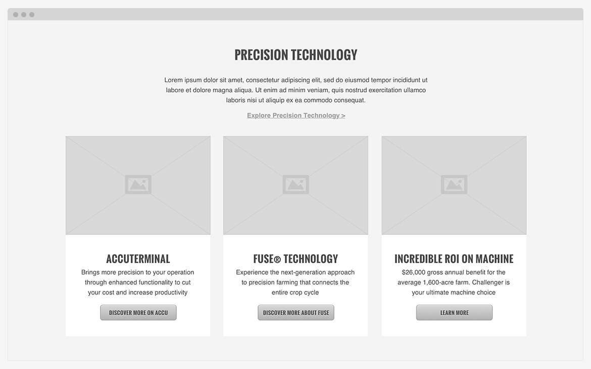
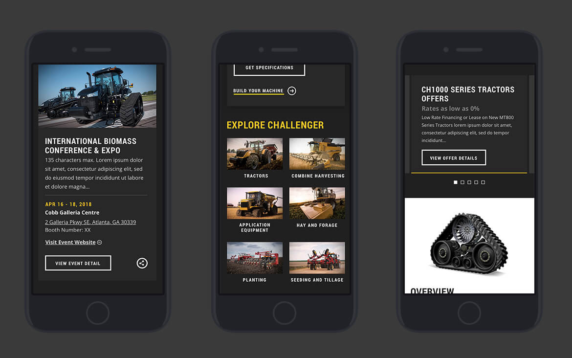
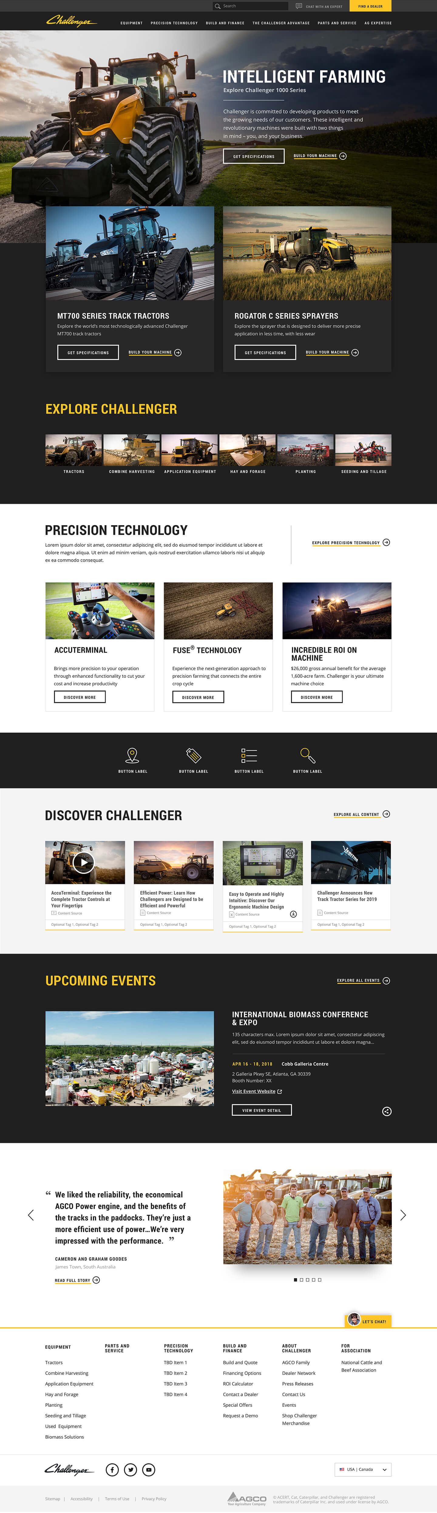
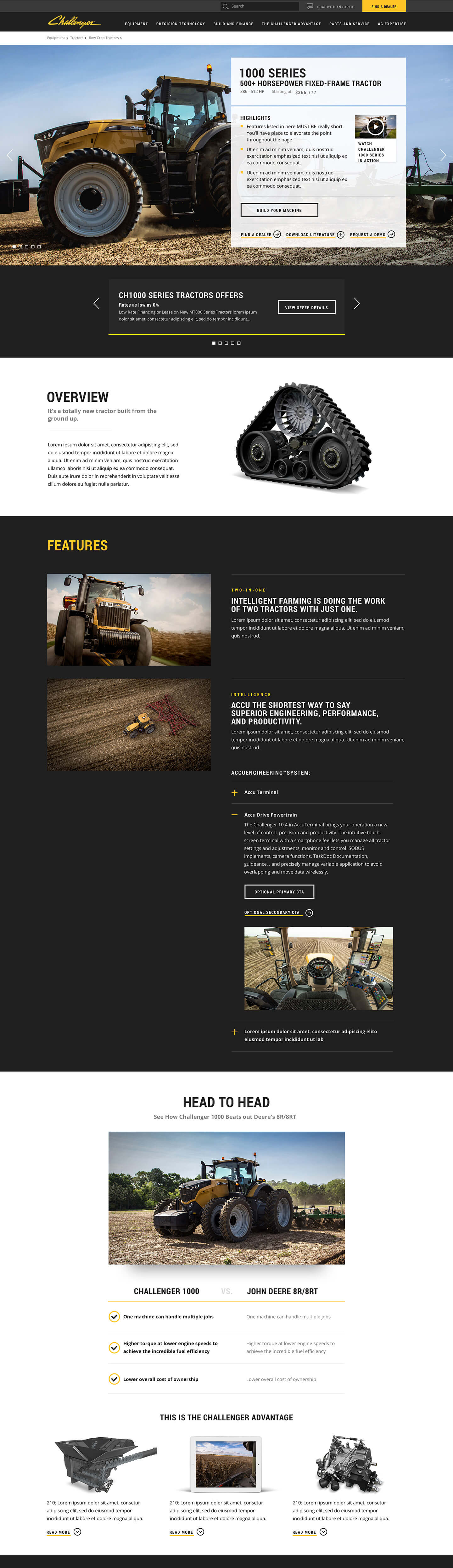
Wireframe
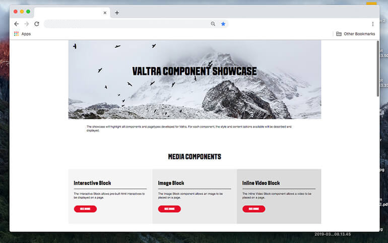
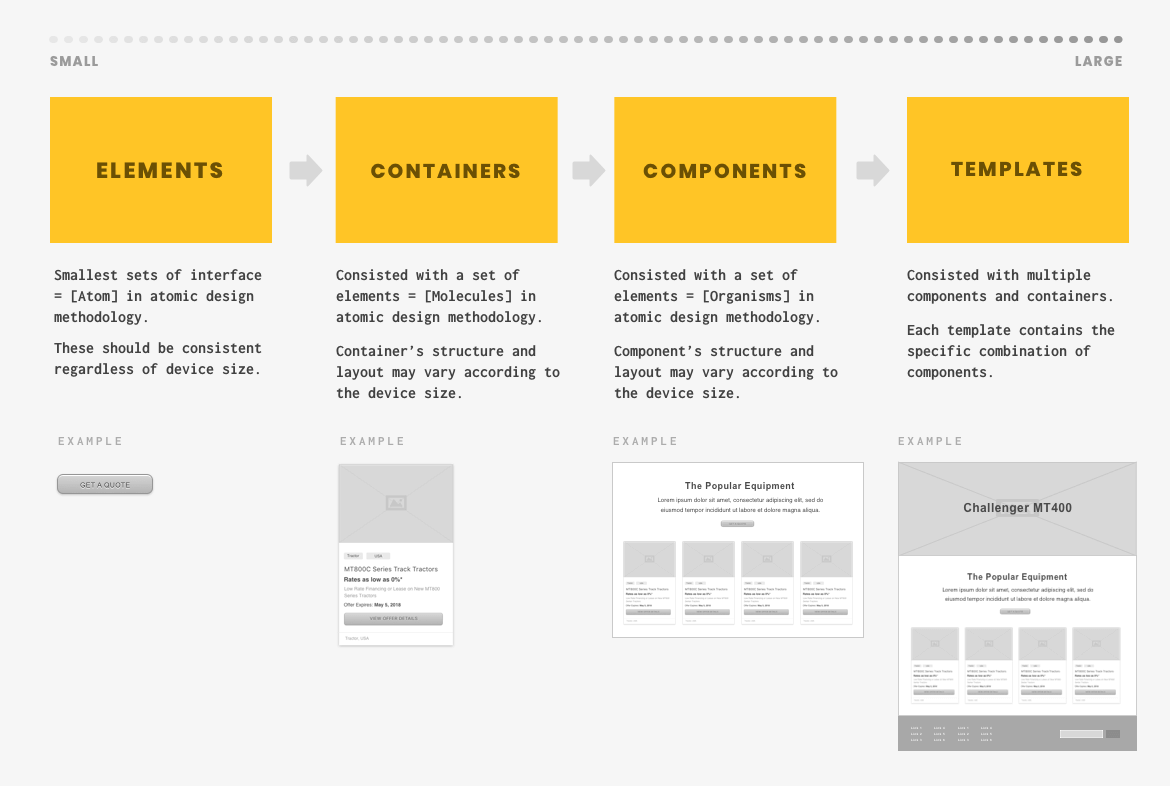
Atomic Design System
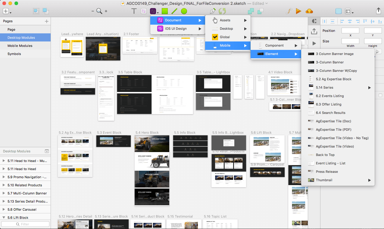
In order to develop a comprehensive design system, I re-learned the Atomic Design System. It’s a system that you can use to strategically develop the design elements and recycle them as much as possible to create a consistent visual language.
Since my wireframe is more high-fidelity, I wanted to think ahead of design system at this stage. In order to explain this system to my teammate and client, Brad Frost’s vocabulary was a little bit too chemistry-focused to understand, so I renamed certain items in my design system.
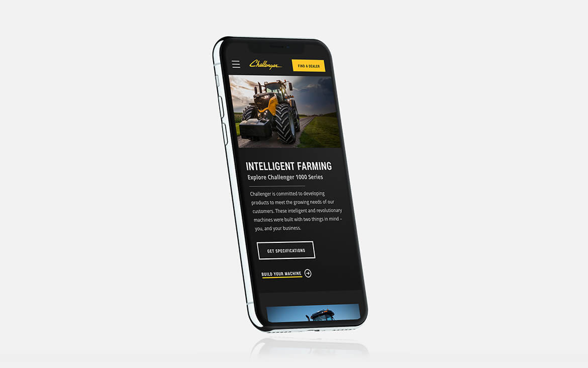
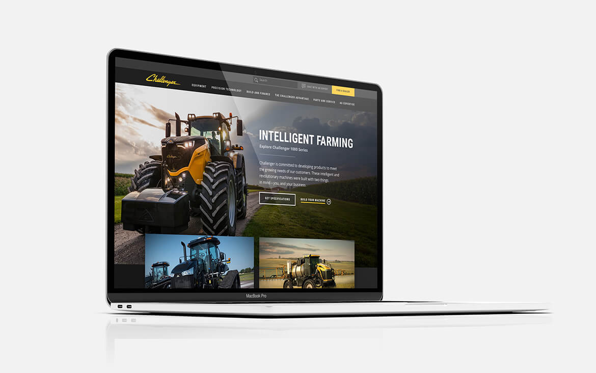
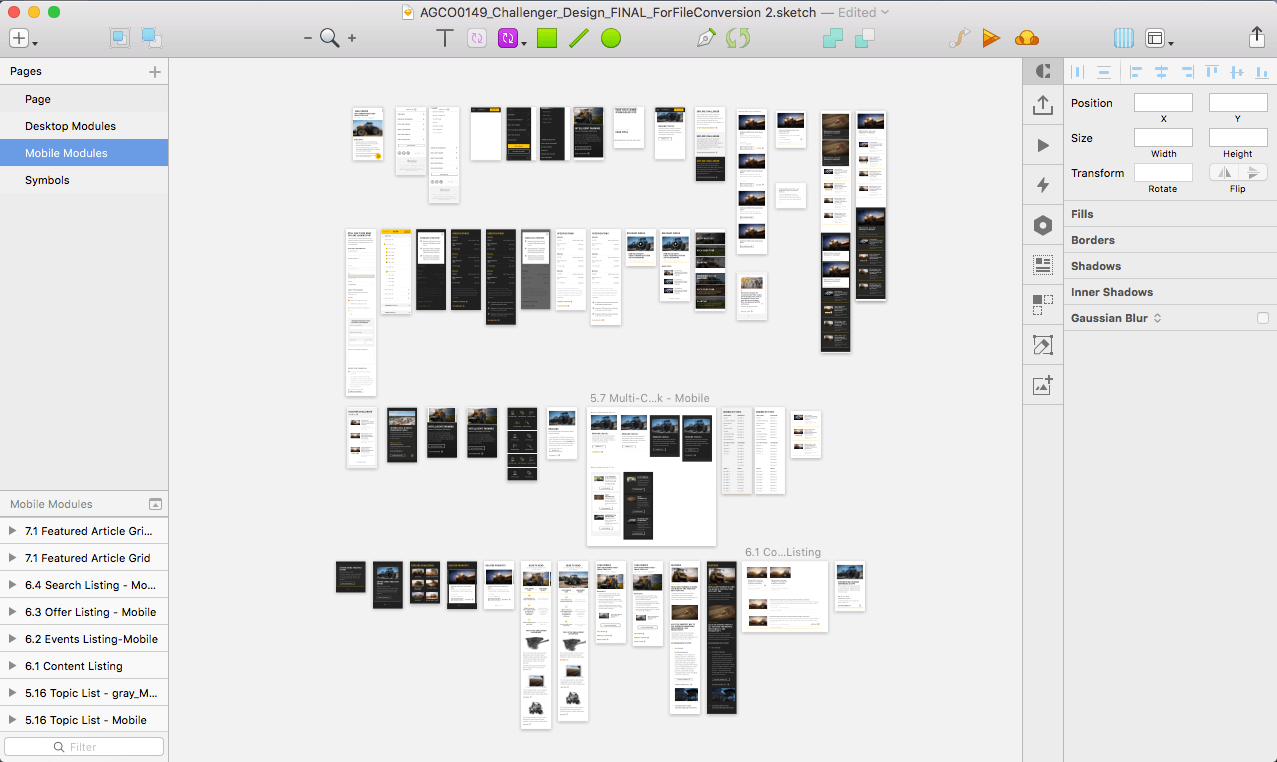
Mobile First Approach
Challenger site was mainly accessed via mobile, so I took a mobile-first approach to make sure layouts, functionalities and content hierarchy were highly optimized for mobile experience.
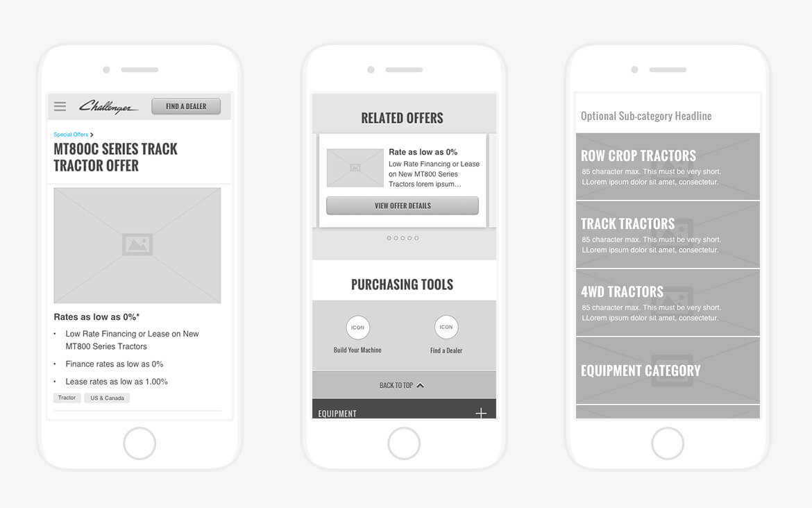
For me, mobile first approach was a great way to hash-out unnecessary things to focus on a good mobile experience, but our client had a hard time understanding the content hierarchy. The initial plan was to roll out all mobile wireframes, but we immediately switched to desktop to make sure clients fully understand our intended experience.
Lesson learned:
Mobile first approach is the best-suited for people designing, but for reviewers, this could be tough to understand if they aren’t familiar with mobile layout and experience.
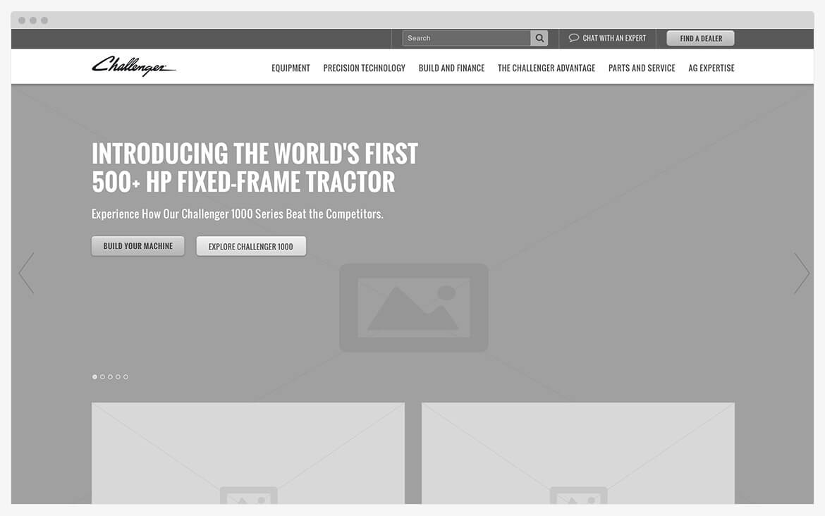
After realizing the clients are having a hard time reviewing the mobile wireframe, we immediately switched the workflow to present desktop layout. Being able to realize ‘the gap’ and having flexible process and teammates is key to a successful reviewing cycle.
Prototype
Created prototype to make sure the information is easy to find and the layout is easy to use. We didn’t have a usability testing budget so I tested with my friend to see if he can find the information. He wasn’t a perfect test subject, but gave me insights on the layout, CTA labeling, and headline vocabulary.
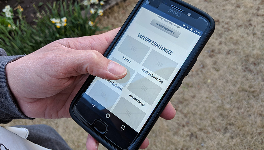
Insights showed that farmers are most likely accessing the site via mobile while they are outdoors and engaging with tasks, so I had a tester be outside to mimic the target users’ environment.
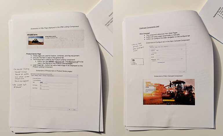
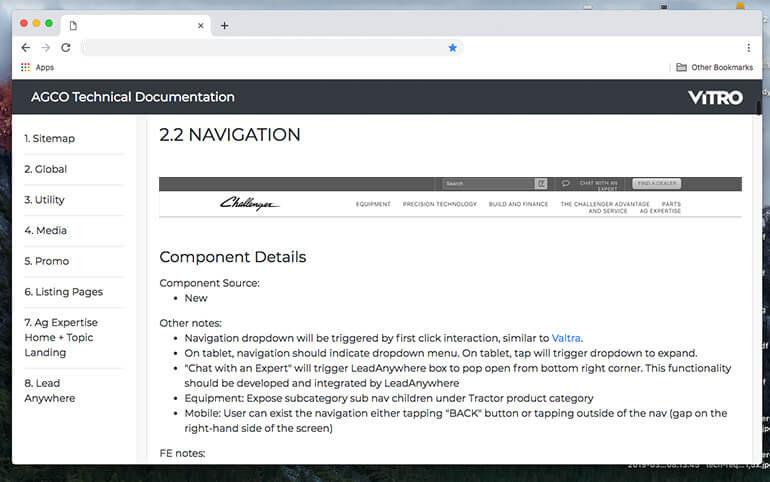
Technical Documentation
We built a simple Wordpress site to organize the designed modules and their functionality specification in one place. We could have used JIRA but it turned out that building a simple site is much more budget friendly!
Here’s how we organized our modules:
- New vs. Modified module
- Content Type
- Global Element (Nav and Footer)
- Utility (Breadcrumb, Tabel, etc)
- Media (Image Gallery, Video Carousel, etc)
- Promo (Hero Block, Callout Block, etc)
- Listing Pages (Product Listing, Search Results, etc)
And we specified the following information to each module:
- Admin’s capability
- Column Structure
- Functionality
- Image Size
- Character Count
- Necessary data input fields
- Which this component is being used
- Module variation
3. Design
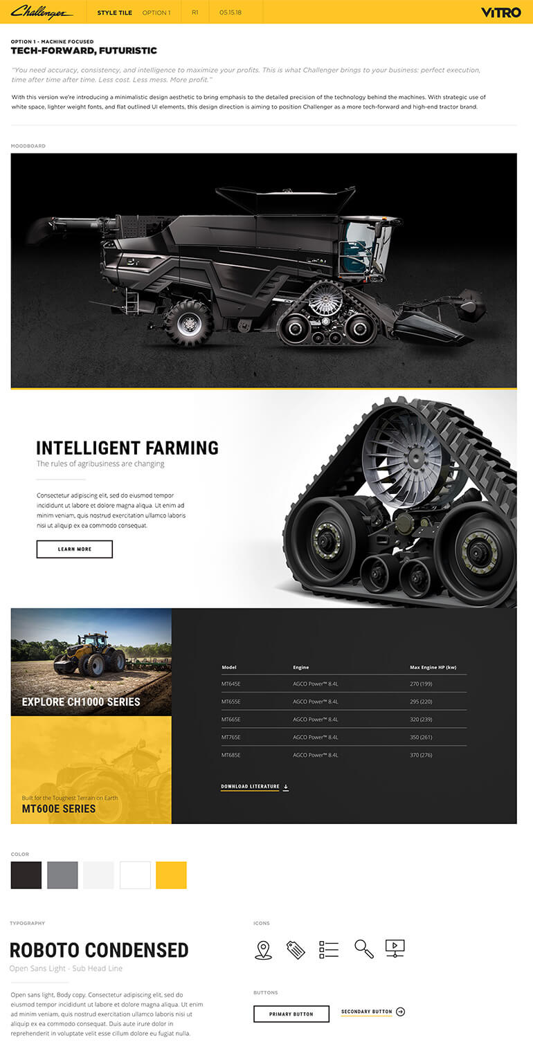
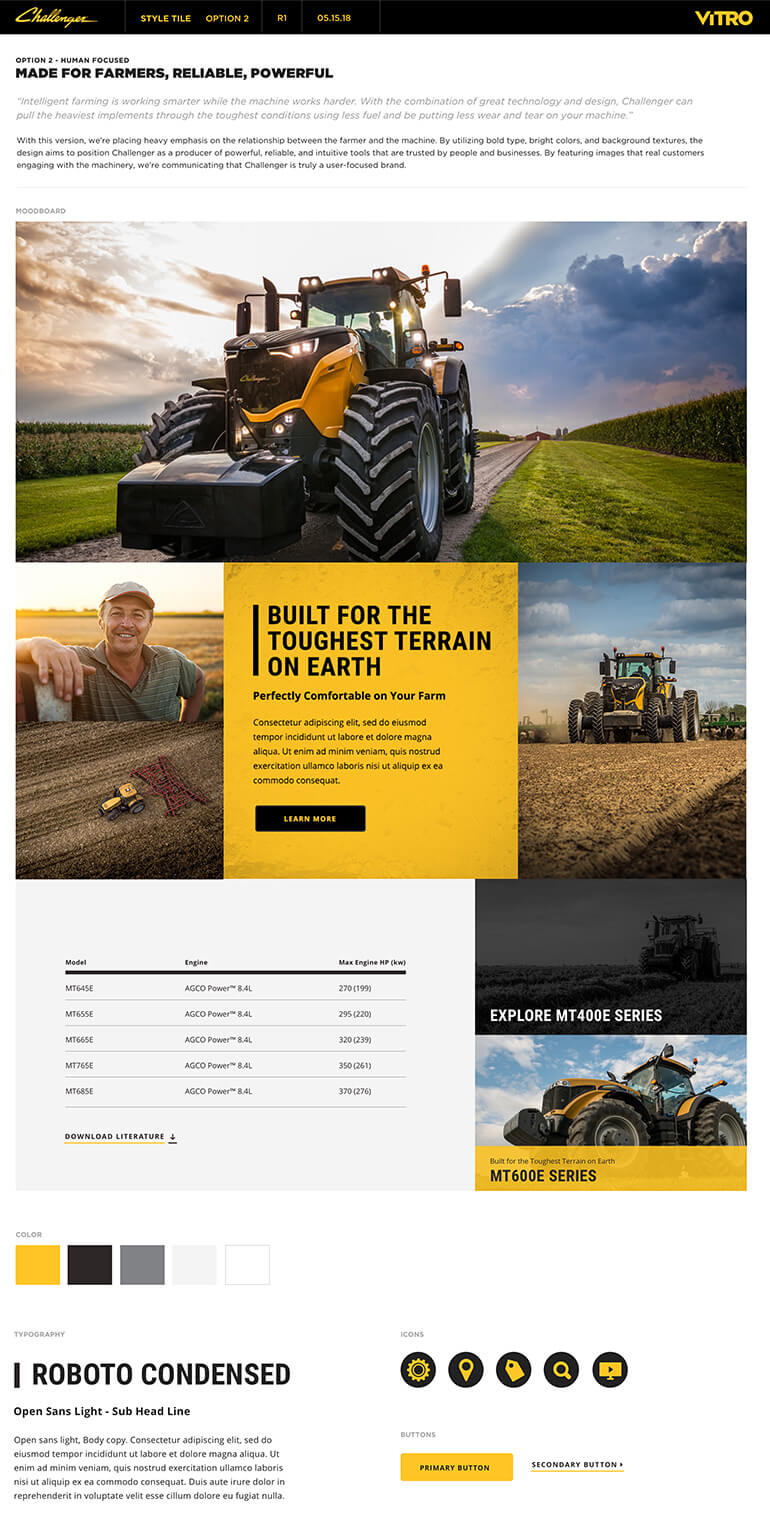
Moodboard and Design Exploration
The goal was to “make the new site look more techy and smart”, but the design direction from the client was very ambiguous. It seems like the client didn’t know exactly what they like, so we proposed to present a mood board first to align on the design direction.
I designed mood boards by respecting the current branding. I kept the base colors but explored different color hierarchy. I also sought out a variety of design directions by bringing in different UI treatment, textures, icon styling, and photography treatment.
Below are the two mood boards that I presented.
Design
With the approved mood board, I began developing designs and system by following Atomic Design methodology.
Here’s something I paid attention to during the design:
- Consistent throughout the modules
- Clear content hierarchy within each module
- Modules will still look good with any combination
- Provide different color scheme of each module for admin to have layout flexibility
- Stick with a few image aspect ratios for ease of image production
- High contrast for accessibility and viewing websites in outdoor environment
4. Deployment
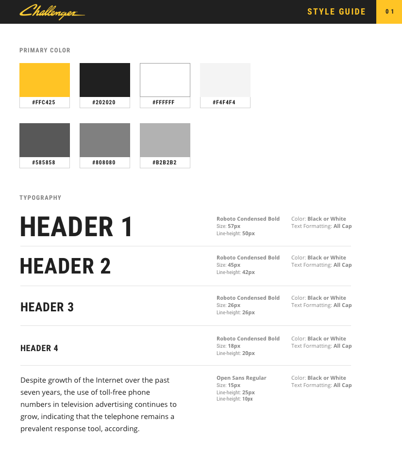
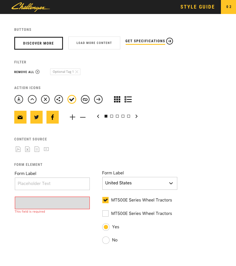
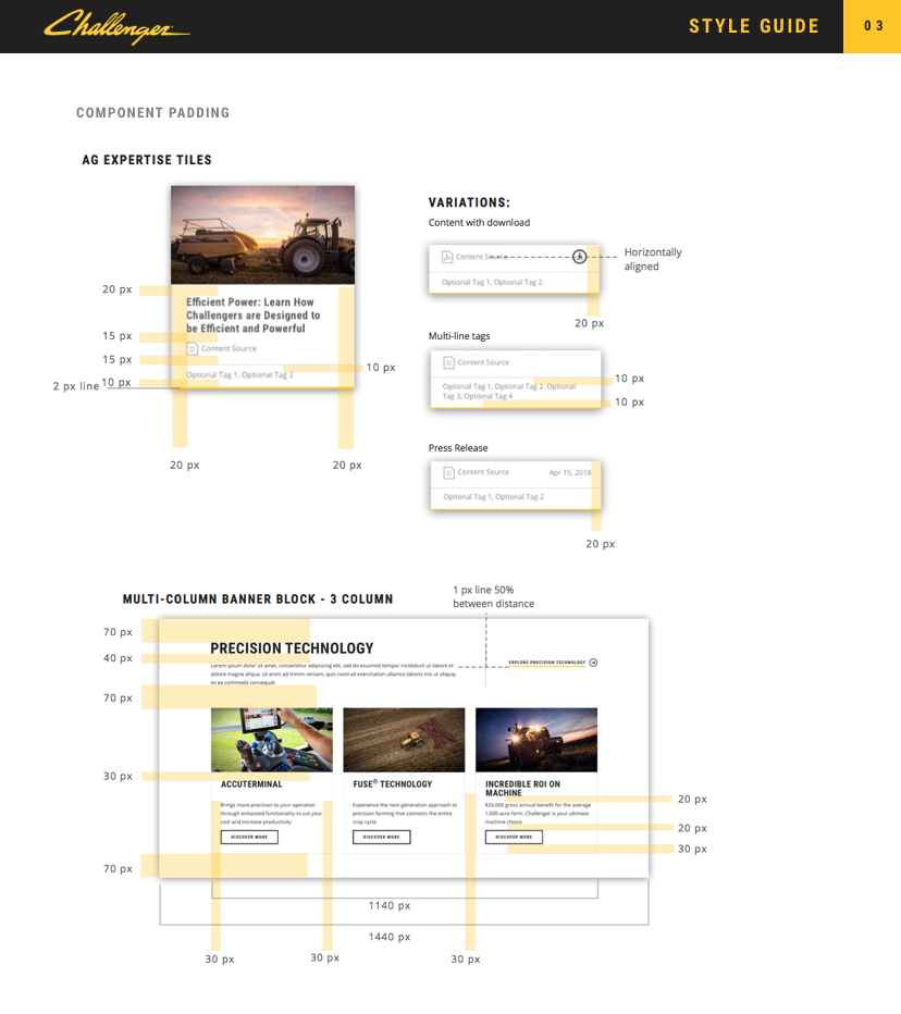
Styleguide
To ensure the visual design being accurately executed during deployment phase, I prepped a style guide for the developers.
Dev Team Walk Through and Handoff
Everyone had access to the online technical documentation, but we wanted to make sure that our dev vendor clearly understood the intention. We set up a conference call and walked through the modules one by one, and handed off all files and documentation.
Currently, this project is under development. Usually after the hand-off, our dev manager and I will be constantly communicating with dev team and assist with QA and any issues or questions that may come up during the development until project launch.
Lessons that I learned
The importance of spending a significant amount of time in research
Being in an agency environment and solo UI/UX Designer, sometimes it gets hard to secure enough time to conduct knee deep research. In this project however, I coordinated with my project manager to make sure I was heavily involved in the discovery phase. This in fact helped me to truly understand the issue and users’ needs, and allowed me to quickly ideate layouts and interaction design during the wireframe stage.
The myth of Mobile-First approach
Mobile first certainly has the advantage for designers but it might not be the best approach to present designs to clients (this only applies to responsive website projects). Both clients and non-technical department members had a hard time reviewing on mobile layout first. Maybe next time, we’ll consider starting mobile design first, but present desktop design first.
Set up Technical Documentation sooner rather than later
My team tends to wait to set up technical documentation until wireframe is over, but this could have been started even during the discovery phase when we were gathering Technical Requirements. Having one dedicated place to hold a variety of technical information is extremely important (especially when multiple entities are involved in the project).
Designing with “What If”
At every stage of this project, I kept asking myself “What if…?”. "What if the content author wanted to stack module A with module B?", "what if the content author started applying more than 5 categories?", “What if the image is missing from this module?”, etc. This thinking process helped me to think through the module’s usage scenario to make sure my designs are flexible and accommodating.
View More
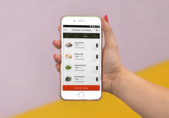
Adobe Live Ramen Ticketing AppUI/UX, Mobile App
ICE MobileMobile UI/UX Design
Employee Training PortalUI/UX, Educational Tool
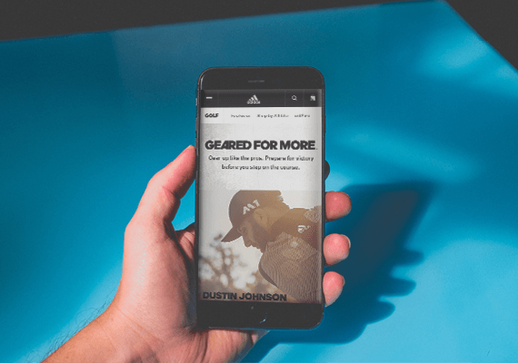
adidas.com MigrationUI/UX, Website Migration

UC San Diego Break Things Better CampaignUI/UX, Campaign Microsite
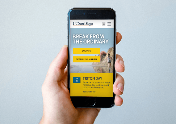
UC San Diego Main Website RedesignUI/UX, Website
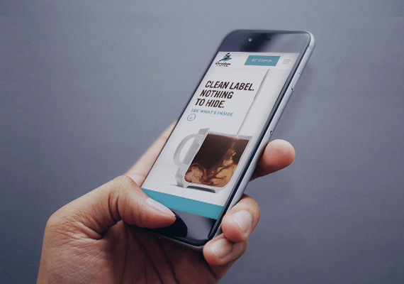
Caribou Coffee Clean Label CampaignUI/UX, Campaign Landing Page