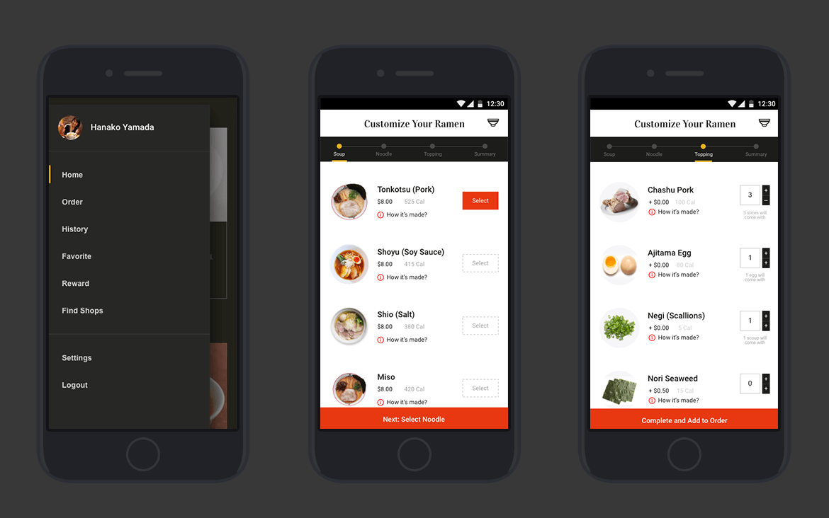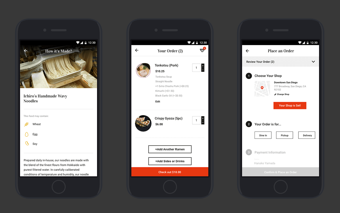
Adobe LIVE - Ramen Kiosk App
AGCO Challenger Website Redesign
Introduction
Adobe Live
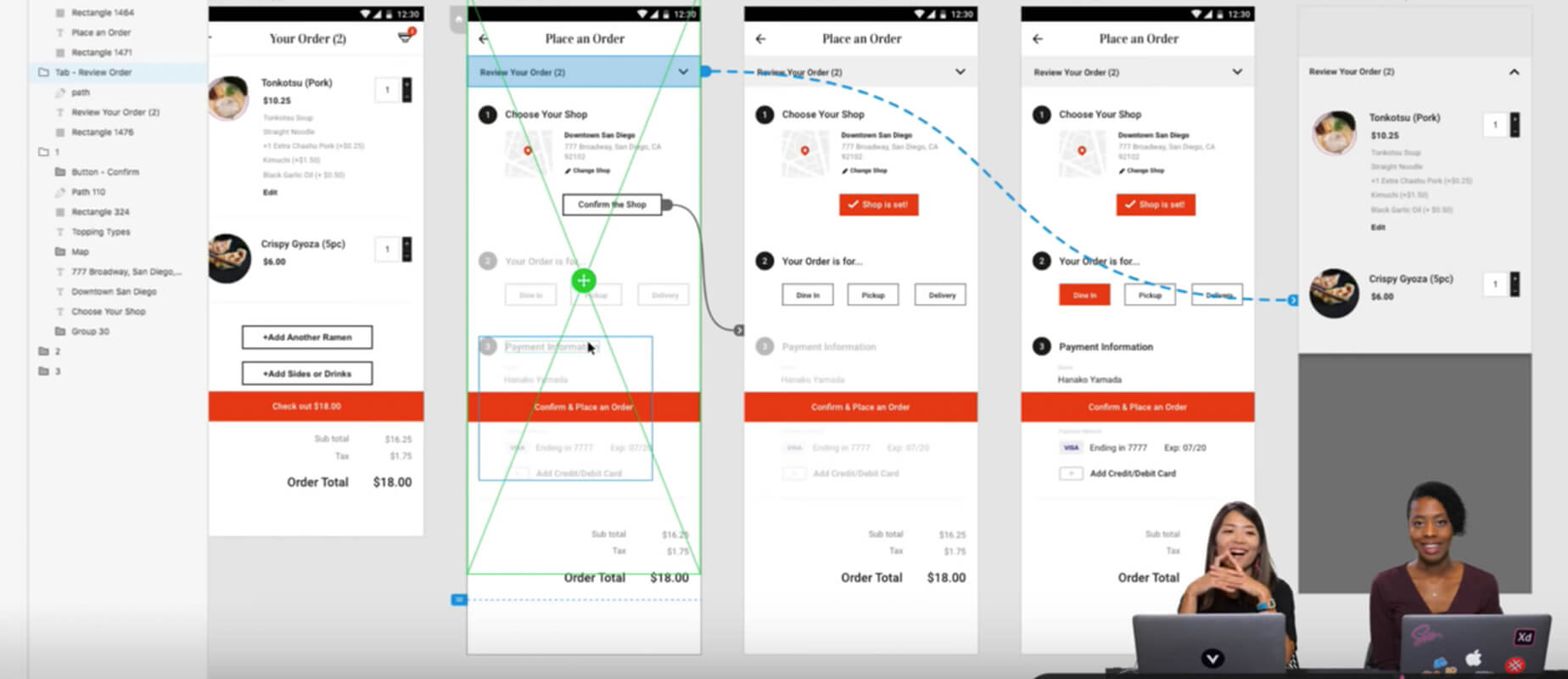
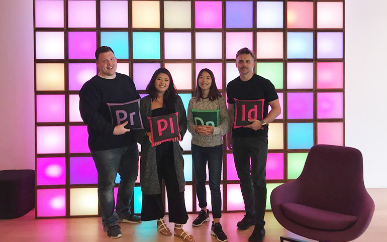
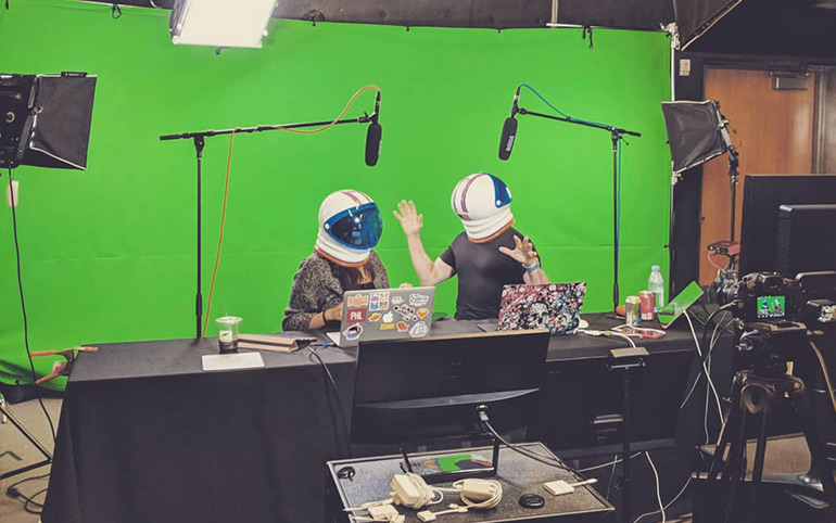
In August 2018, I was invited by Adobe to present my creative process at their 3-day live webcast series, Adobe Live. Beginning with a topic of my choice, I demonstrated their new design software Adobe XD, as well as how I ideate and strategize digital products. During the live show, I walked through my methodology for creating a digital product — from user research to building prototypes. We had audiences from everywhere around the world and it was very inspirational. I was so grateful for this amazing opportunity.
ROLE
Guest Presenter
Live Stream Presentation
UI/UX
UX Research
YEAR
2018
ROLE
UI/UX Designn
UX Research
Content Strategy
Technical Documentation
Front-end Direction
YEAR
2018
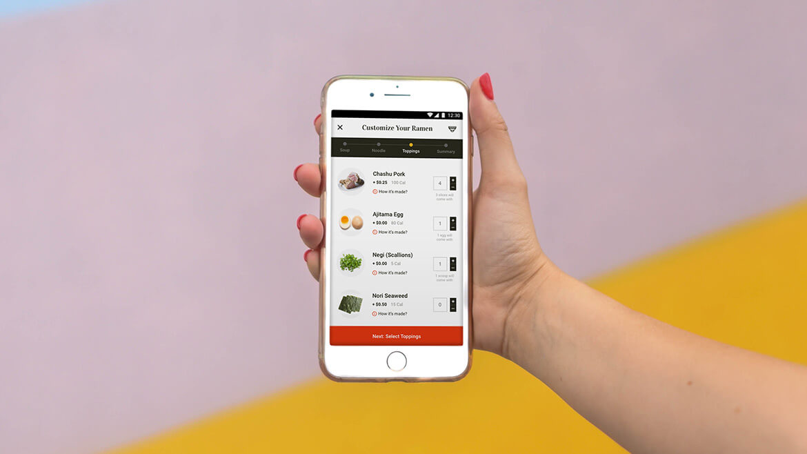
My Topic: Ramen Ticketing App
Being in San Diego, it’s impossible not to notice the rapid growth of ramen restaurants. As you see Starbucks on every corner of the neighborhoods, I see ramen shops. Then when I drove pass them, I started realizing one common thing: there is always a long line. How long is this waiting line? According to Yelp reviews for these places, people wait for like an hour to two hours!
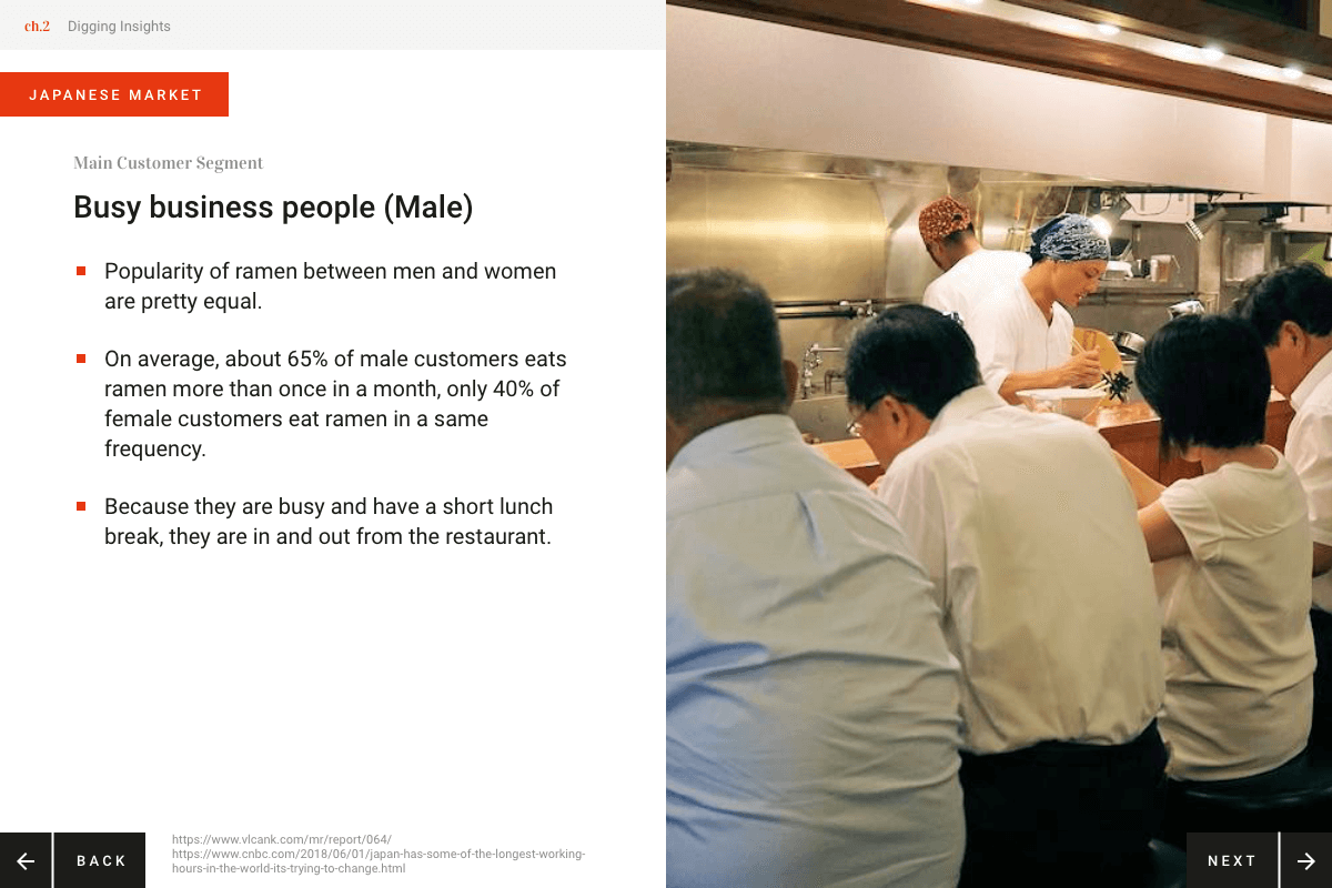
Good restaurants always have a wait line, so it is not a surprising fact. However, as a Japanese native, I couldn’t believe how slow the table turn rate is here in San Diego. When you go to ramen restaurants in Japan, people are in and out. It is because Japanese ramen shops have a very efficient way of running a restaurant - integration of the Ramen Ticketing Machine. This system empowers customers to self-serve as much as possible, like placing an order and paying their own bills. It helps a restaurant to focus on cooking and serving food as fast as possible.
I wouldn’t expect for San Diego restaurants to start bringing in this machine, so I started wondering if there’s another way to integrate a system like this via a mobile device.
Hence, I decided to design an app experience that mimics and enhances the Japanese ramen ticketing machine for my Adobe Live presentation.
Challenge
When I talked to the Adobe team and past presenters, they all said the presentation has to be “fun, entertaining and engaging”. I only had an experience of presenting to my clients (who are usually pretty serious and business-like) so it was a challenging, fun experience to brainstorm how I would prepare my presentation. I thought my ramen topic was entertaining to our young audience, I focused more on how to structure my presentation flow that’s insightful and easy to follow.
Presentation Structure
I had a 2 hours live stream slot for 3 consecutive days, so I structured my presentation into 3 parts: Research/Discovery, Experience Design, Visual Design + Prototype. I wanted to present in a way that I would normally approach to any UI/UX projects.
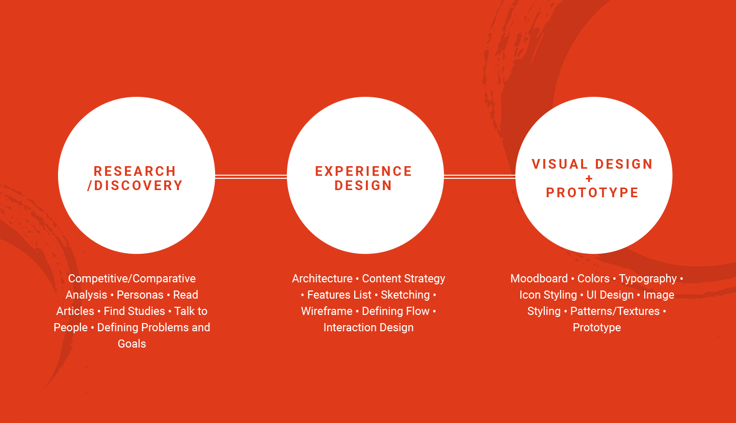
For Research/Discovery part, I showed how I gathered insights and presented final discovery slides.
For the Experience Design part, I walked through experience design best practices, how I usually set up my files, wireframe do’s and don'ts.
For the Visual Design part, first I showed how I ideate and collect visual inspiration and design best practices.
Finally, when all screens were ready, I built a prototype to make sure content flow and screens were linked as intended.
1. Research/Discovery
Understanding the Audience
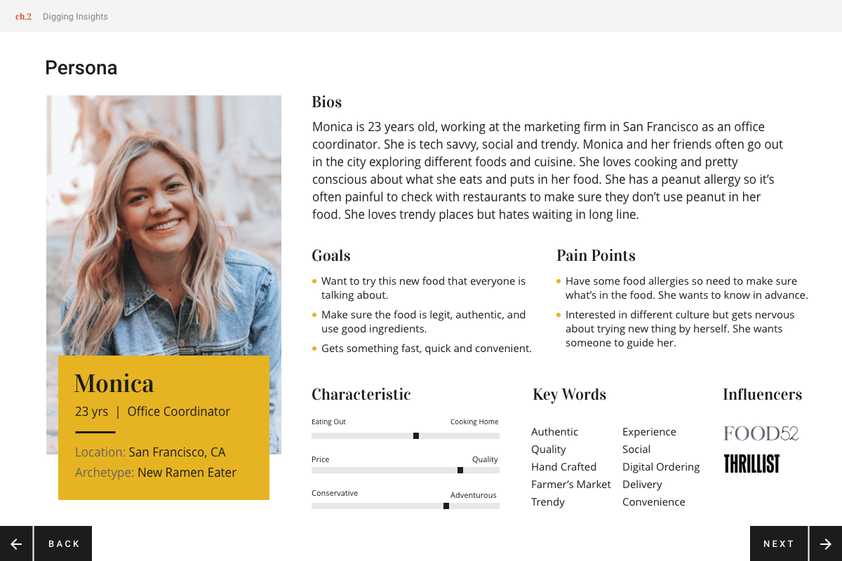
In order to understand my potential users pain points, I talked to a couple of my coworkers who go eat ramen in San Diego quite often, asking questions like “How often do you go eat ramen?”, “How frequently do you need to wait?” and “What do you do while you are waiting?”.
During the conversation with them, I often heard their complaints about the waiting time. Also they left comments like “I didn’t know what to expect for the food” and “I still don’t know what was in my ramen.” This conversation made me come to realize many ramen shops in San Diego don’t provide in-depth information like how ramen stock is made and it’s full list of ingredients. These insights inspired me to make my app to be more informational and engaging rather than just being able to order/purchase a ramen meal.
Ramen Market Research
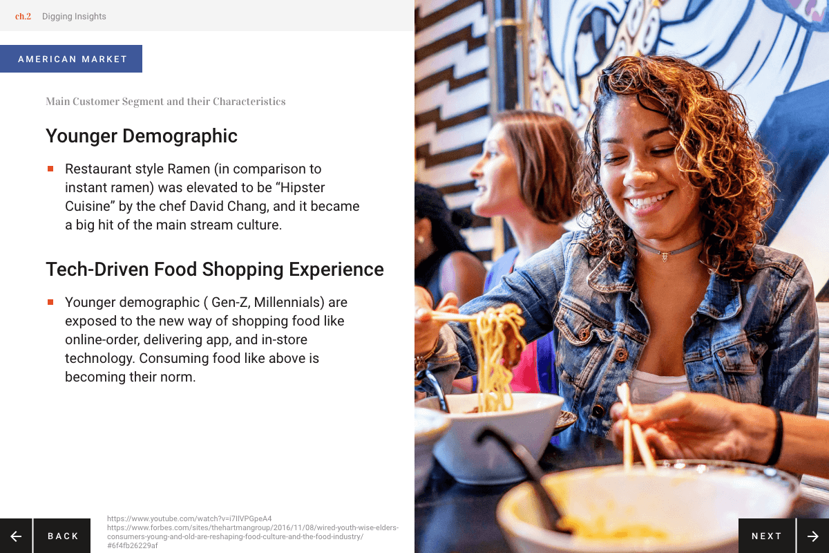
I was curious to know why the ramen ticketing machine was even invented, so I researched on the state of ramen industry in Japan and the history of the ticketing machine. By understanding the full functionality of the ticketing machine and its advantages and disadvantages, it helped me to come up with the core functionality that I want to incorporate in my app.
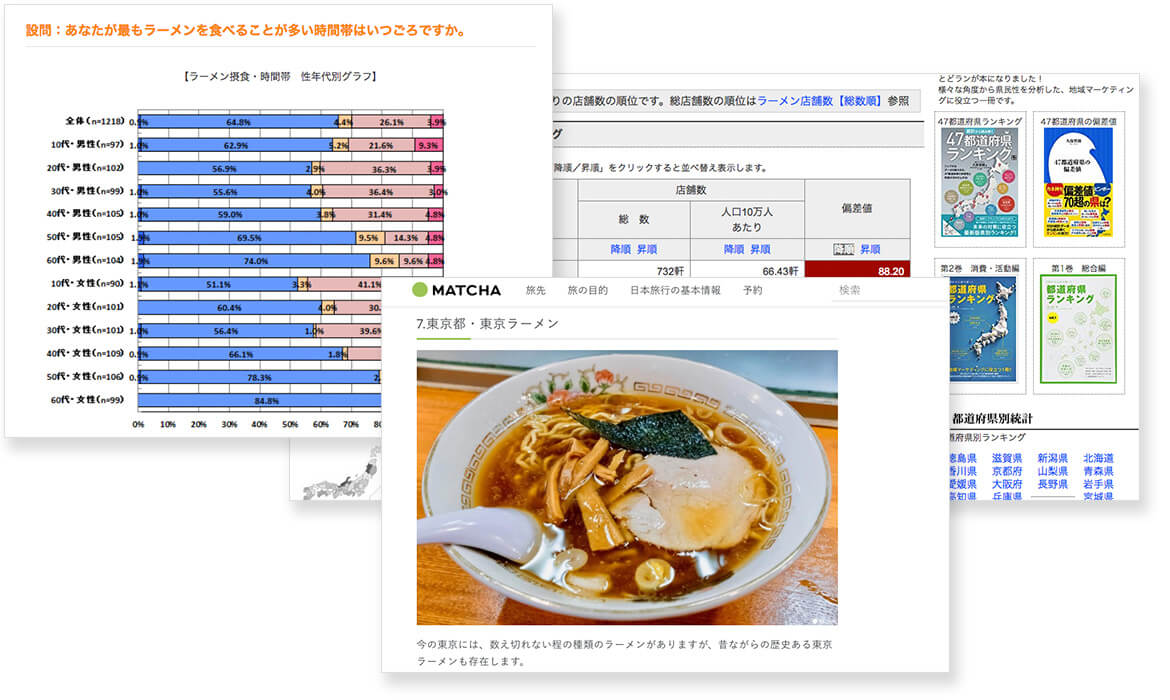
I also wanted to understand how the ramen culture is being adopted in the U.S., so I conducted research (lots of googling) on the American ramen industry as well. Having information on both sides helped me to clearly understand what aspect of the ticketing machine might/might not work in the U.S. market.
Food Industry Research
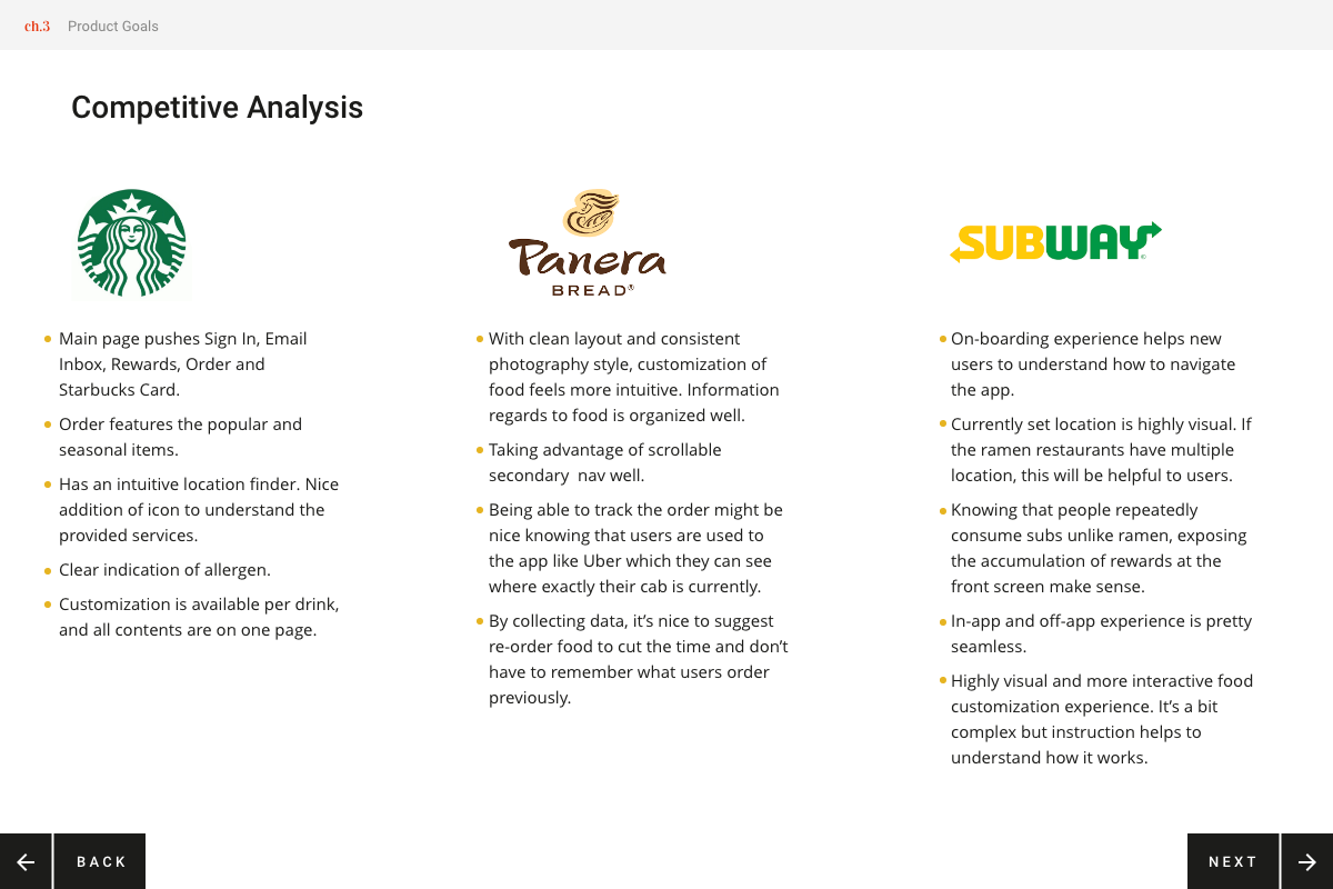
I researched on how other food apps work to understand the flow, functionality and their strength. I chose Subway, Starbucks, Panera as research subject because they focus on online transaction and the audience is similar to my ramen app.
Analyzing and Organizing Findings
After gathering insights, I created one comprehensive document containing organized findings and my analysis. Once I start designing, it’s easy to derail and forget the core product goals, so it’s important to have a cornerstone like this.
Interactive slide show
2. Experience Design
Strategy
Feature List
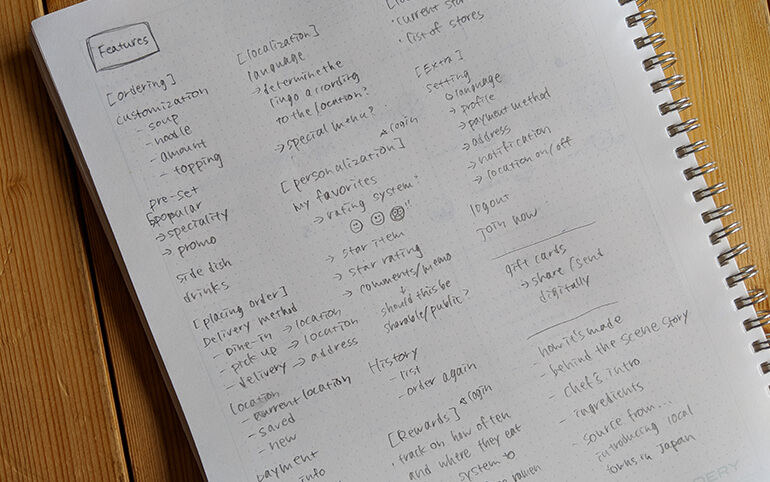
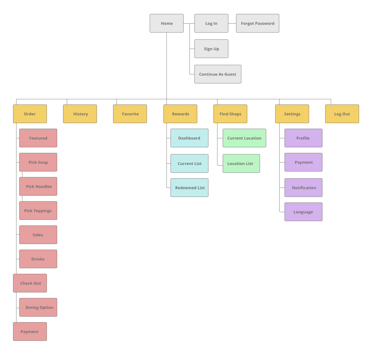
Based on the insights and inspiration I gathered, I scribbled down all possible features that might be helpful for my potential app users. Then I narrowed down to the crucial items following the persona and the goals that I defined earlier.
Things that I was considering during this exercise:
- The bottom line is user must be able to place an order and pay easily
- I asked myself “Would my user really need this feature to accomplish XYZ?” to make sure if the feature is “must have” item for my users
- Not crucial but unique app experiences that I want to provide:
- Expecting that customers might have waiting time regardless, there should be a way to pass the time with entertainments provided by this app.
- Knowing that there are multiple ways to customize a ramen bowl, there should be a way to keep track of the reviews.
- Being inclusive by providing an experience in multiple languages.
Site Mapping
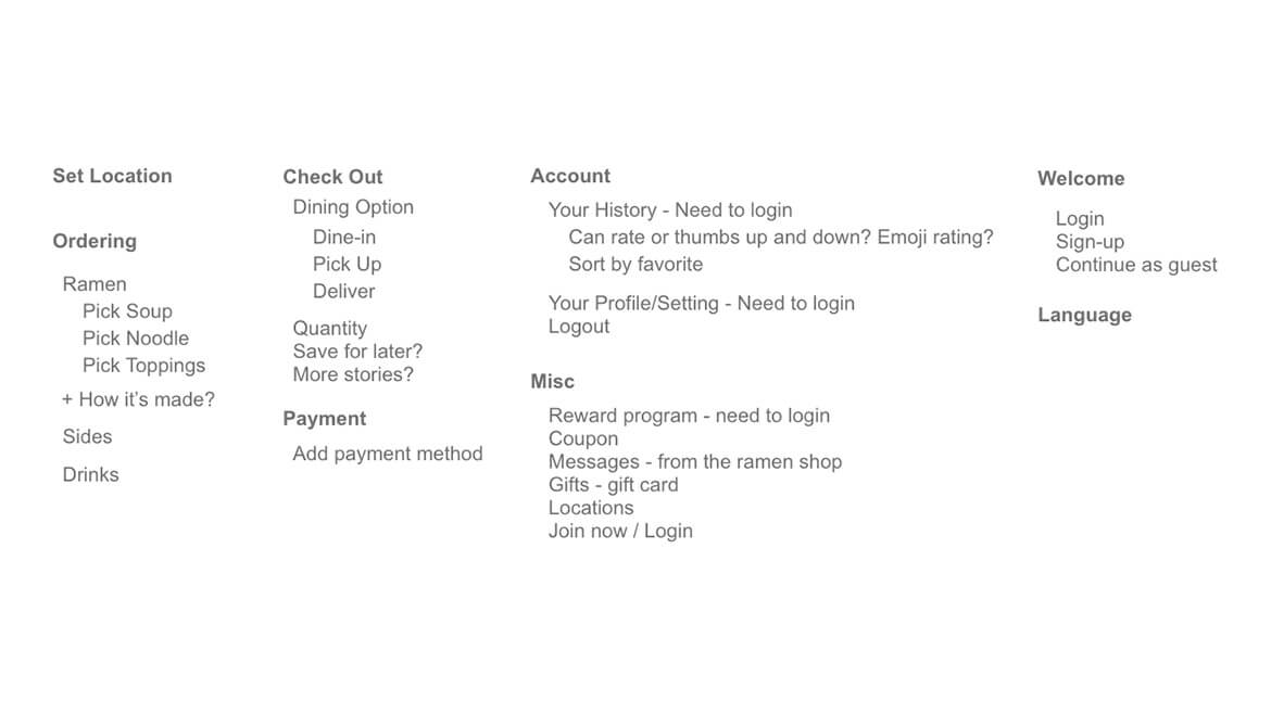
Based on the featured list, I developed a quick sitemap to make sure the experience flows right. During this stage, I also started thinking about which flow I wanted to present during the Adobe Live Show.
Wireframe
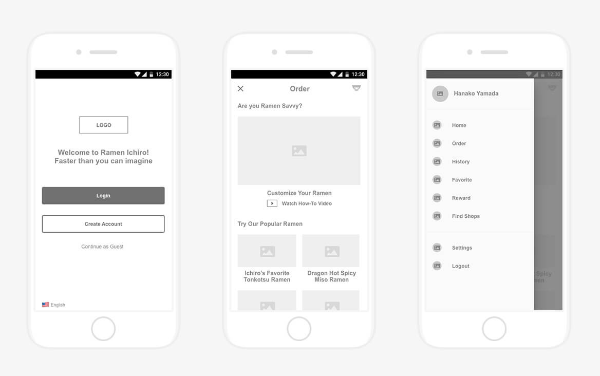
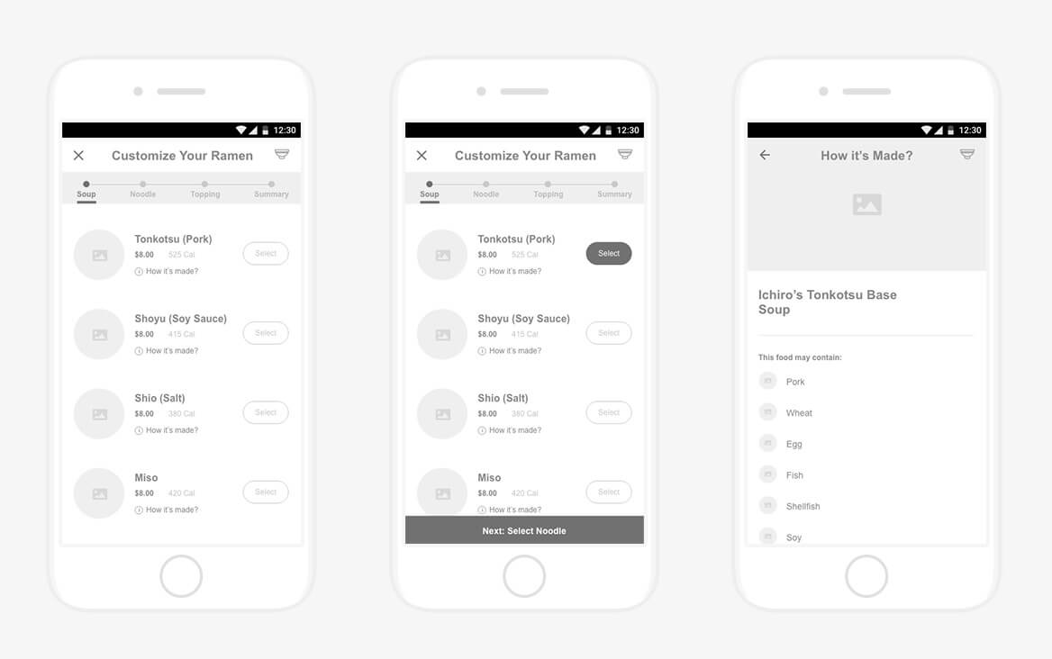
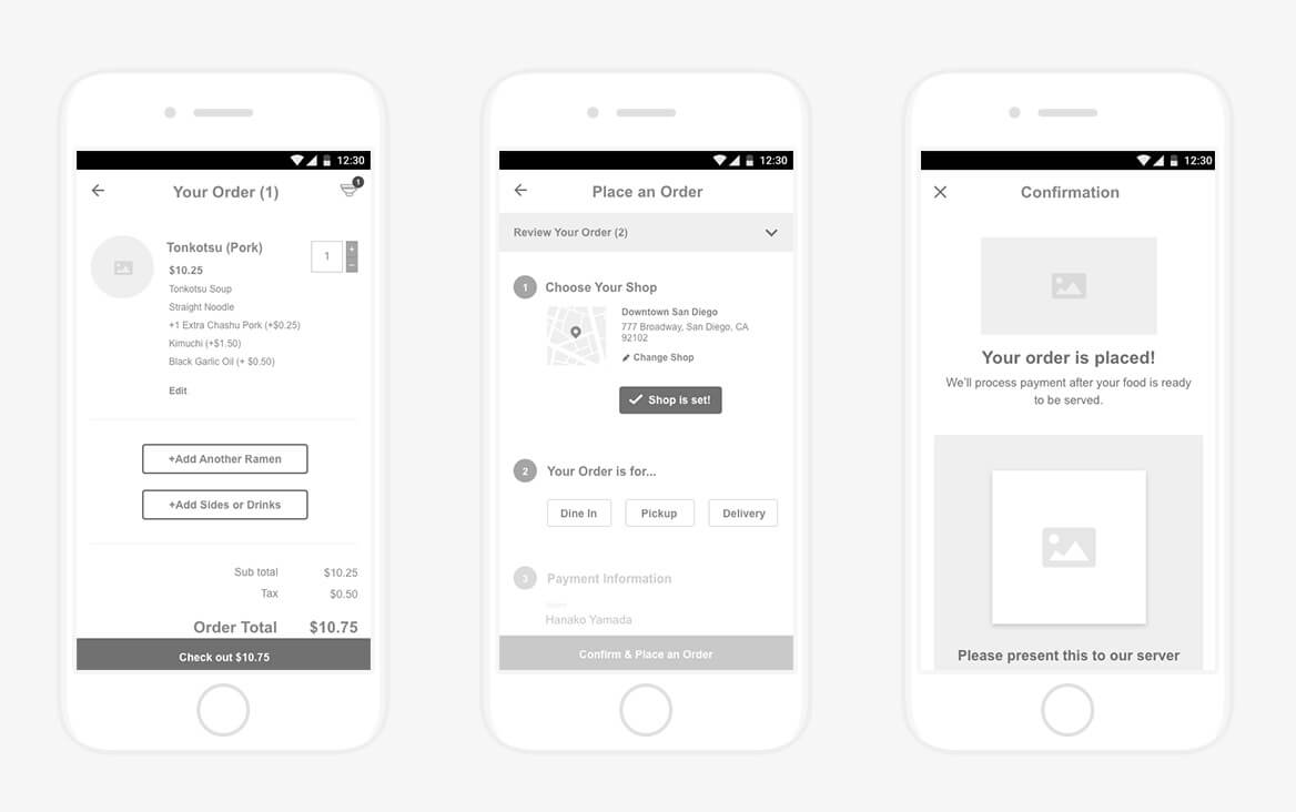
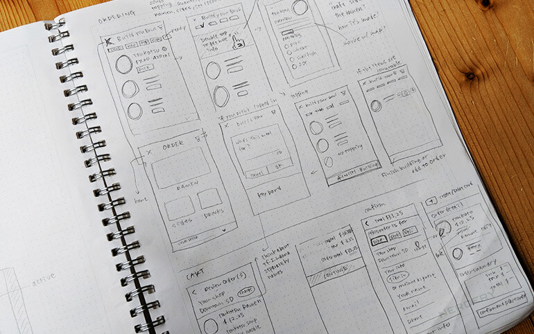
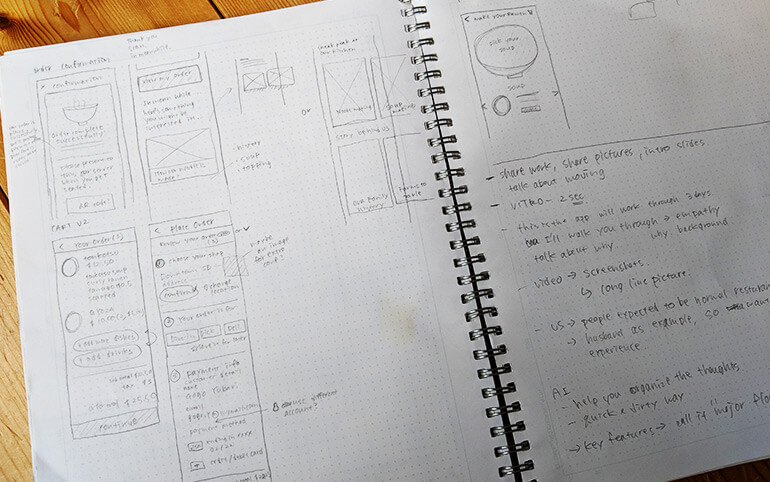
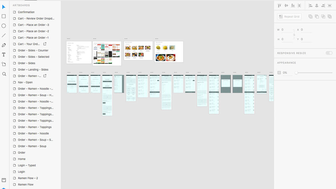
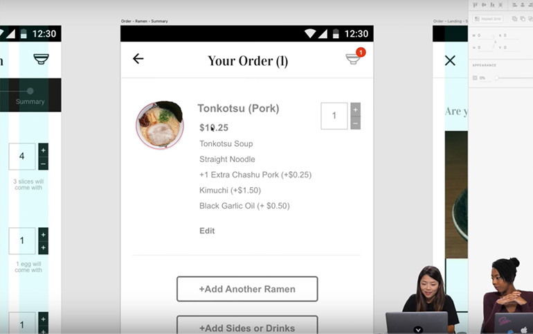
According to the Information Architecture, I started establishing the wireframe to ideate structures, contents and layouts of the app. Ordering a ramen meal online is a quite new experience for my audience, so the key was to make it as flawless as possible. I focused on keeping the ordering process pretty basic and similar to other restaurant apps, so then users will feel familiar, even though they are new to my app. Additionally, customizing a ramen bowl involves multiple steps so I made sure there were always visual cues for users to know where they were in the ordering process.
3.Visual Design + Prototype
Design
In any design project, I always set aside some ideation time by building moodboards. I prepared two moodboards to show how I gather inspirations and how design could take multiple directions.
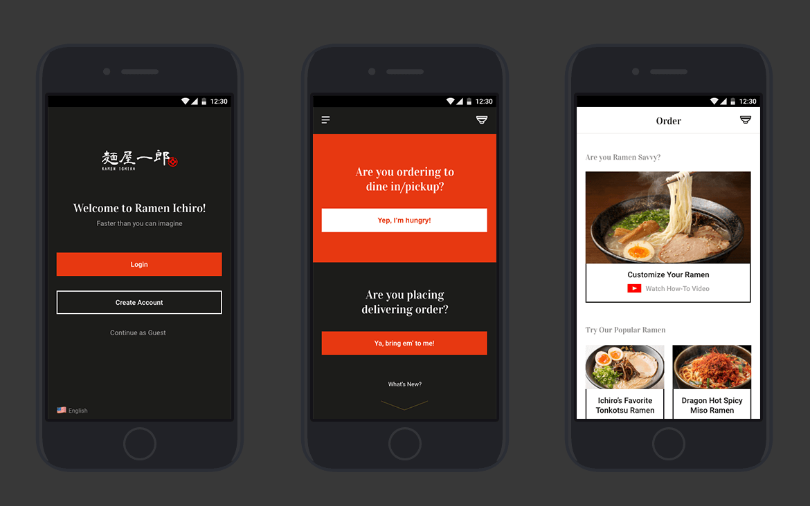
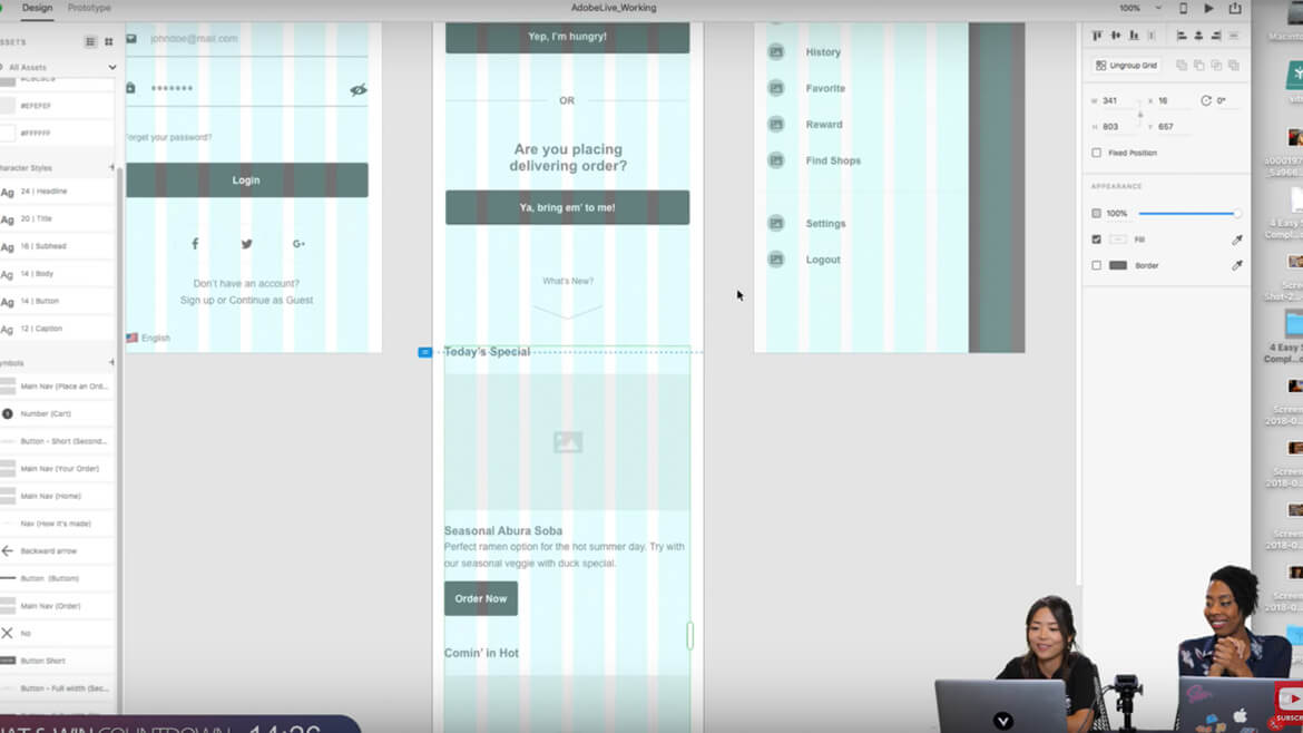
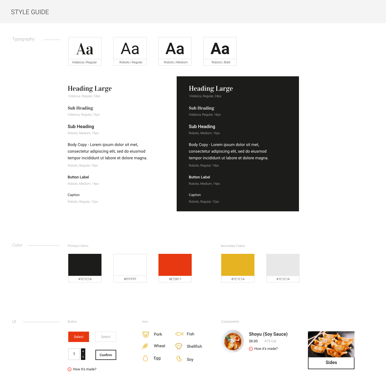
The goal of visual design was to make my target audience want to use (besides my product being easy to use), so I took clean, minimal, and photography-heavy approach to create authentic and trusted feelings.
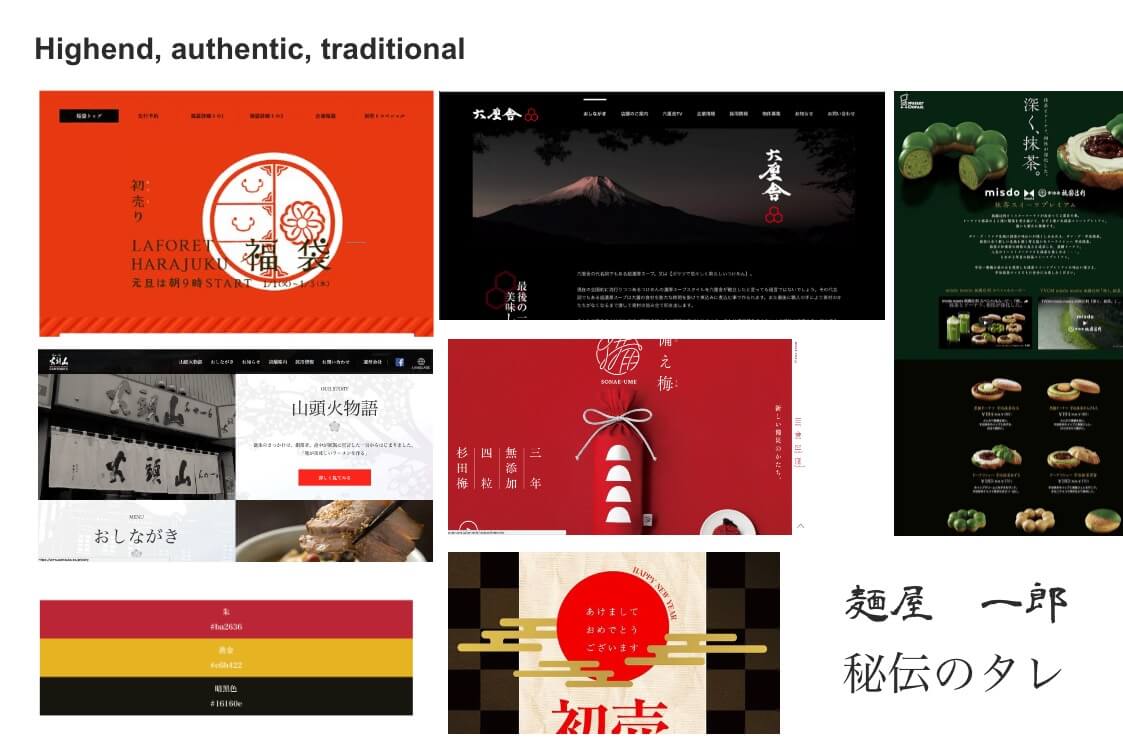
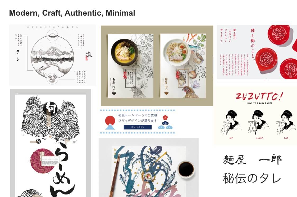
I developed two mood boards to show the audience that designs could take multiple directions. Also, this process helps me to come up with design ideas.
Prototype
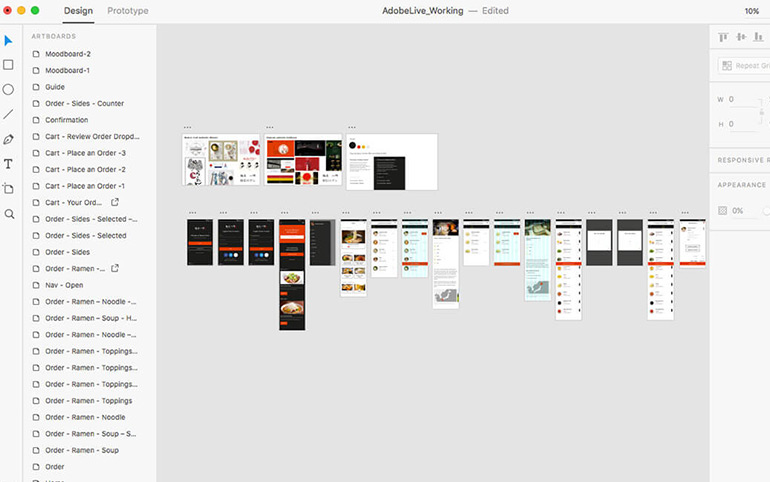
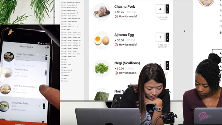
I built prototype with Adobe XD’s feature to make sure all screens flow and interact as intended.
Interactive prototype
Afterthoughts
Being able to be part of this was an incredible and dream-like experience. It was amazing spending time with Adobe team at their San Francisco office and meeting talented designers who ended up becoming great buddies. This experience gave me confidence in presenting in front of a massive audience and I am very grateful for it. Special thanks to Jessica Moon who is my mentor and also helped me review the work prior to the presentation, Michelle Curtis who put the presentation together and HebaH Design for recommending me for this opportunity!
Recordings
View More
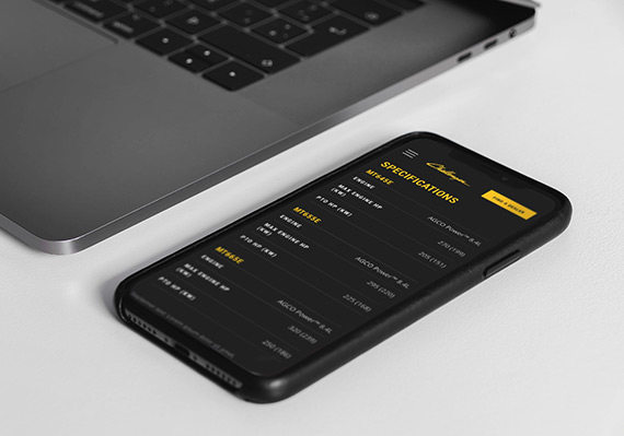
AGCO Challenger Website RedesignUI/UX, Website
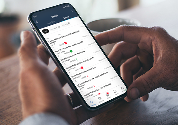
ICE MobileMobile UI/UX Design
Employee Training PortalUI/UX, Educational Tool
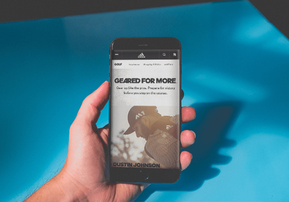
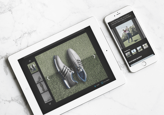
adidas.com MigrationUI/UX, Website Migration
UC San Diego Break Things Better CampaignUI/UX, Campaign Microsite
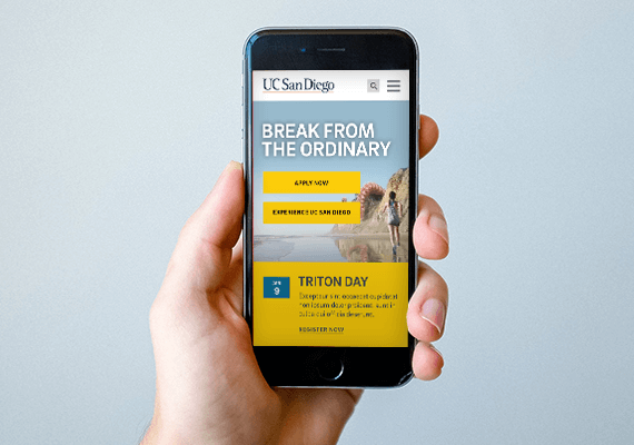
UC San Diego Main Website RedesignUI/UX, Website
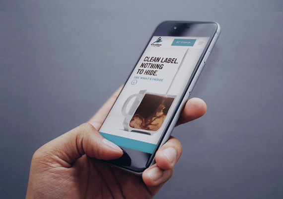
Caribou Coffee Clean Label CampaignUI/UX, Campaign Landing Page
