
UC San Diego Campus Website
We partnered with University of California San Diego and redesigned their campus website with a user-centric approach. Prospective students rely heavily on college websites as their main source of information for an institution, redesigning this website in a way that users can easily and quickly get to the right information was crucial.
-ROLE
Design
Front-end Direction
-YEAR
2016
— TYPE OF PROJECT
Website Redesign
Visit Website
Design approach
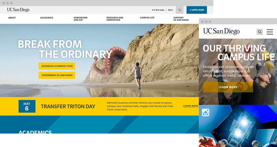
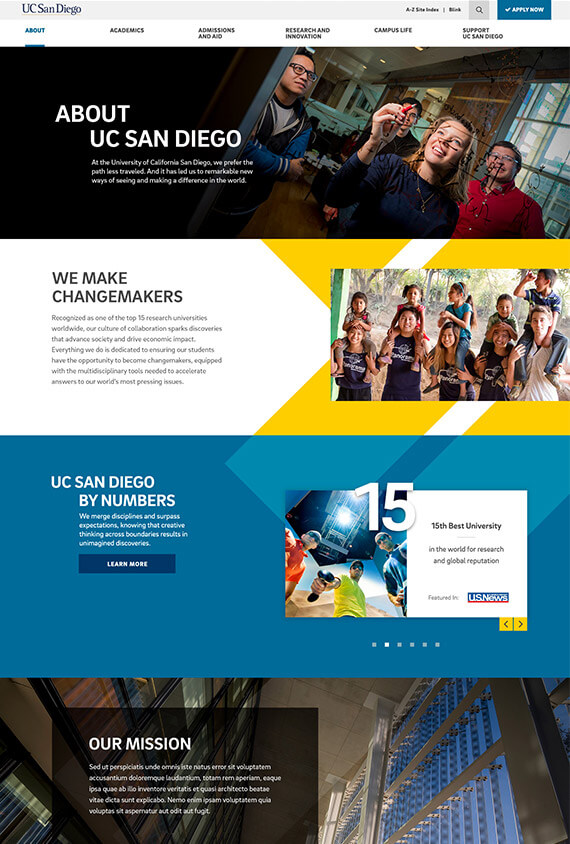
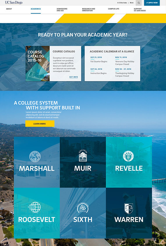
Collaborating closely with a brand team, we established the new look and tone for UC San Diego. Trident shape was introduced as an iconic figure, and let beautiful and authentic lifestyle photography do heavy lifting in communicating the student story of UC San Diego.
LANDING PAGE

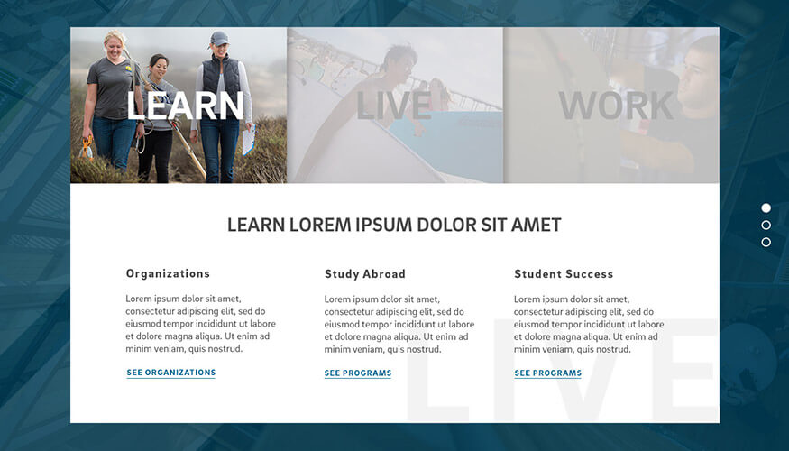
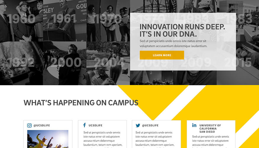
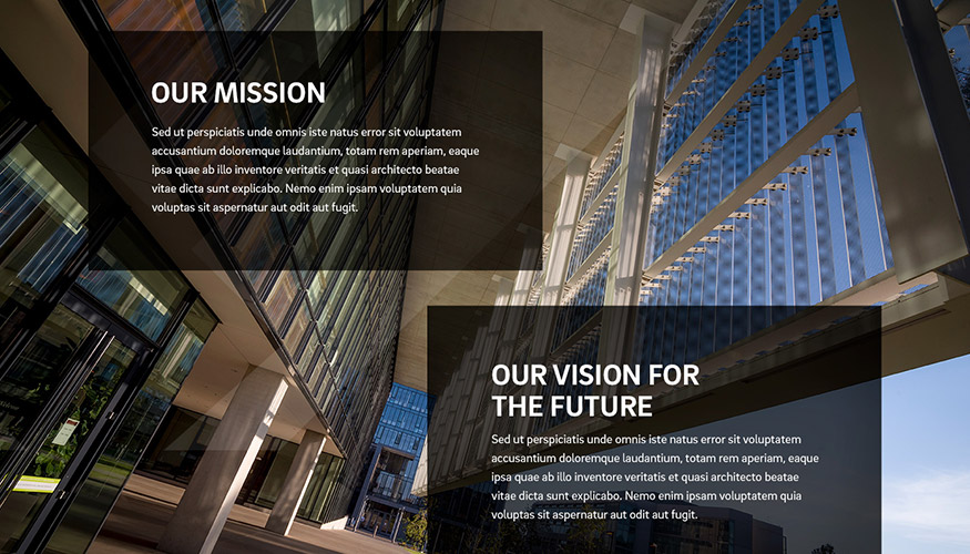

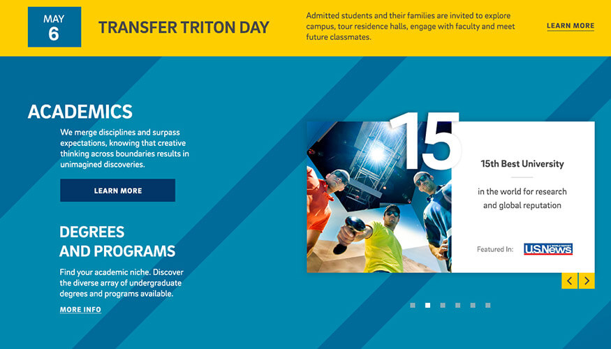
Design hand-off to UC San Diego team
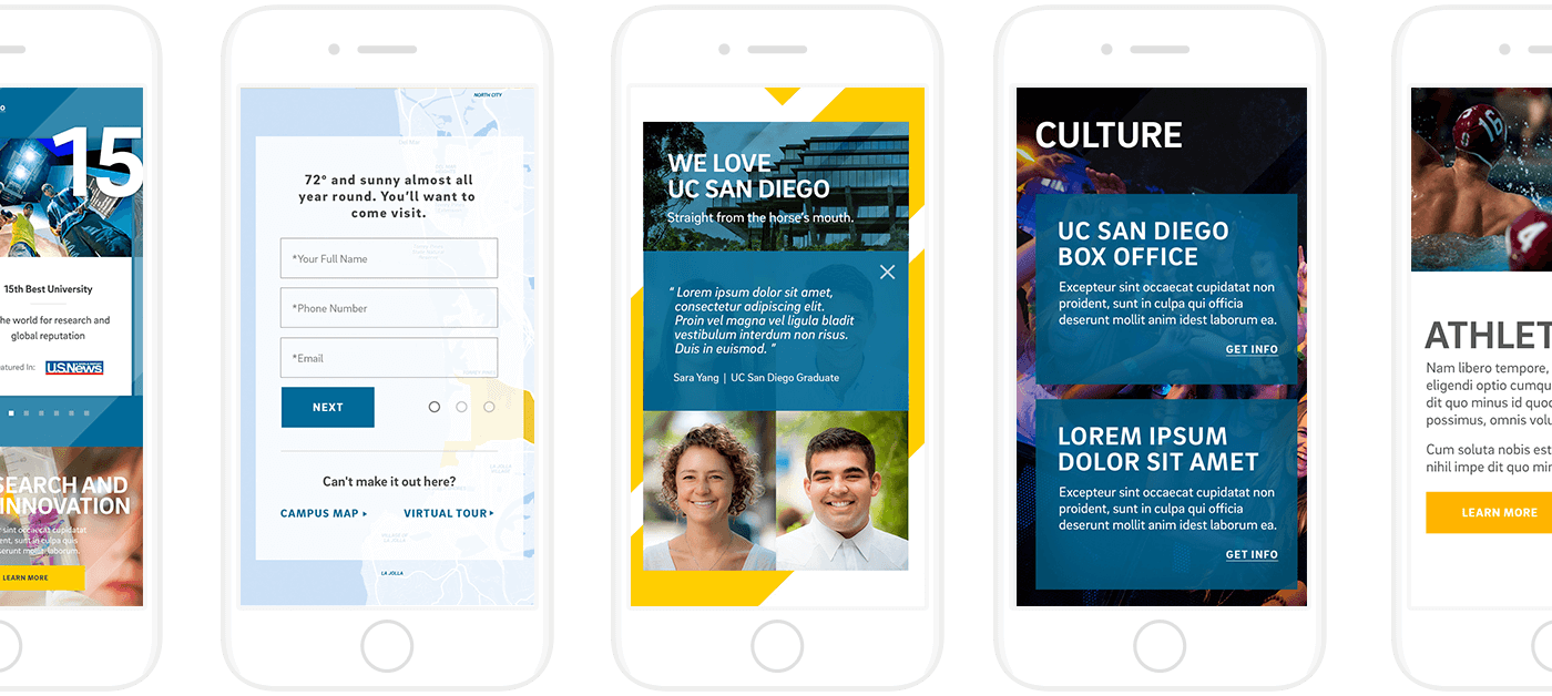
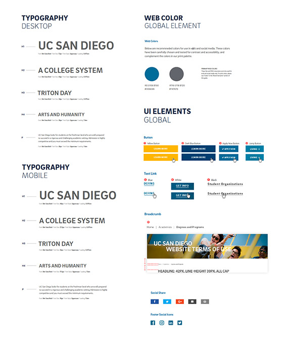
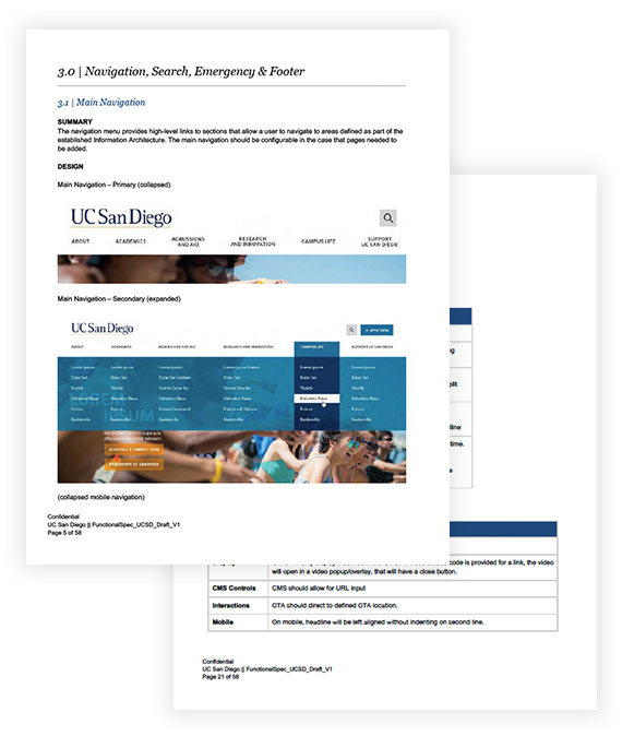
One of the crucial parts of this project was handing off the designs to UC San Diego IT team. Our strategist, lead developer and I worked closely with IT team, and made sure that front-end design hand-off and back-end implementation went as smoothly as possible with a detailed functional specification and multiple prototypes.
STYLE GUIDE
STYLE GUIDE
FUNCTIONAL SPECIFICATION
Results and Key Metrics
page view went up
bounce rate went down
decreased since users are finding the right information and jumping off to deeper contents
View More
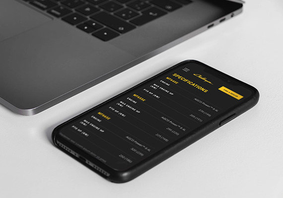
AGCO Challenger Website RedesignUI/UX, Website
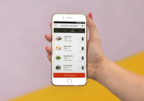
Adobe Live Ramen Ticketing AppUI/UX, Mobile App
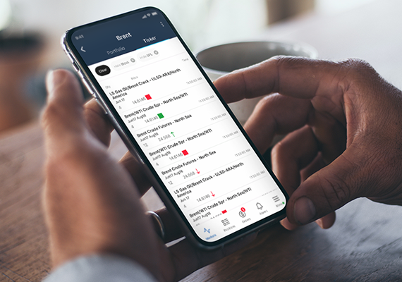
ICE MobileMobile UI/UX Design

Employee Training PortalUI/UX, Educational Tool

adidas.com MigrationUI/UX, Website Migration

UC San Diego Break Things Better CampaignUI/UX, Campaign Microsite
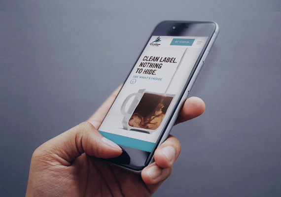
Caribou Coffee Clean Label CampaignUI/UX, Campaign Landing Page