
Website migration for adidas Golf
We were tasked by our client, adidas Golf team, to assist with website migration from adidasgolf.com to adidas.com eCommerce platform by re-defining and re-architecting Golf experience. Our main objective was to continue providing a destination for their community to interact with products and athletes, as well as a bolstering brand story.
-ROLE
Design
UX
Content Strategy
Front-end Direction
-YEAR
2017
Visit Website
-ROLE
Design
UX
Content Strategy
Front-end Direction
-YEAR
2017
Visit Website
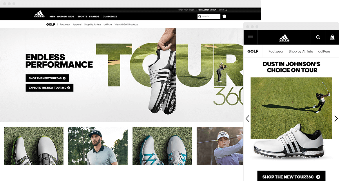
By collaborating with adidas.com’s Website Analysis, Digital Experience Manager, and Digital Content Manager, we refined the sales funnel and user journey. Here are some key takeaways:
- It was interesting to switch gears from focusing on ‘telling a brand story’ to a high sales conversion. We shortened the user journey a lot more in comparison to the adidasgolf.com experience.
- We challenged against ‘typical adidas way’, by trying something they haven’t done before. Our main goal of the site was to create a contained golf experience but we couldn’t achieve this with the limited functionality of adidas.com’s existing framework. By collaborating with adidas team, we introduced golf’s specific new sticky secondary nav functionality to achieve our objective.
- We took a holistic approach to rebuild the golf experience since the migration was happening internationally. Any newly defined structure somehow needed to work for audiences in other regions and countries.
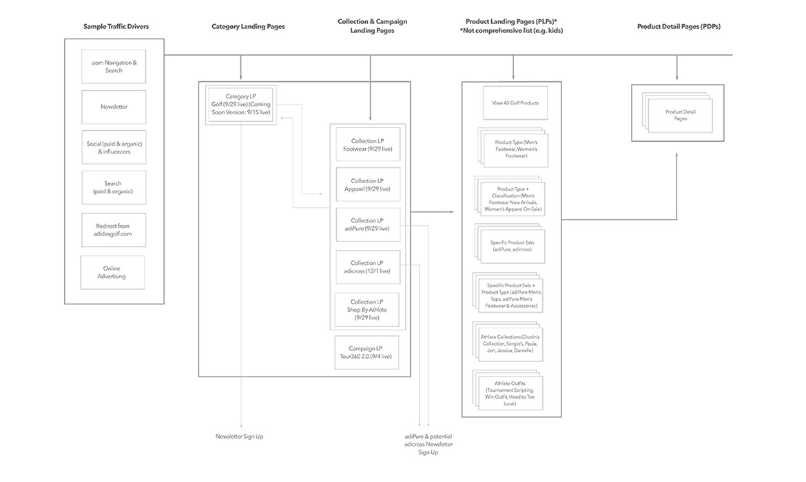
Our strategist and I worked closely with adidas.com's data analysis to build Golf page's new site architecture.
UX Strategies and Wireframing
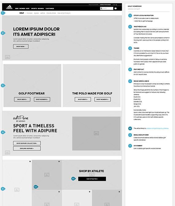
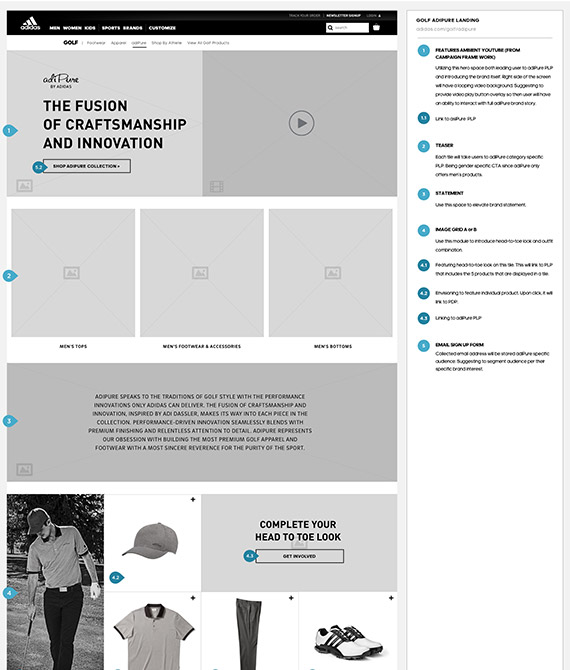
Our wireframe was built with close collaboration of the client to understand their new business goal after the migration, as well as deeply analyzing adidasgolf.com’s data.
I paid extra attention to wireframe annotations since this project involved many teams from different countries. In order to keep everyone on the same page, I made sure to use adidas.com’s terms and language for functionality and component name.

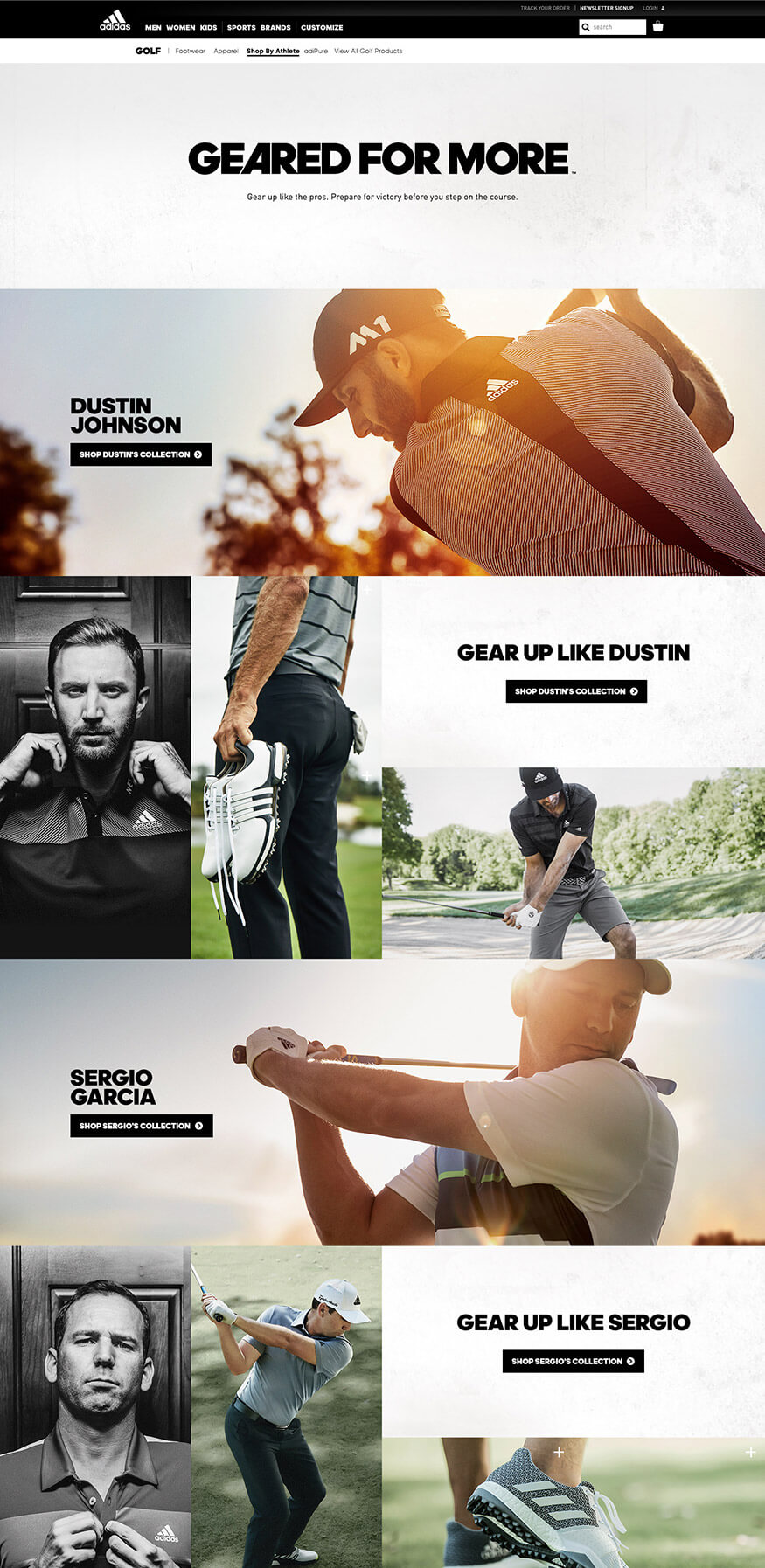
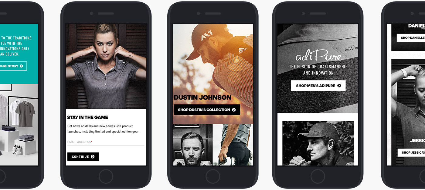
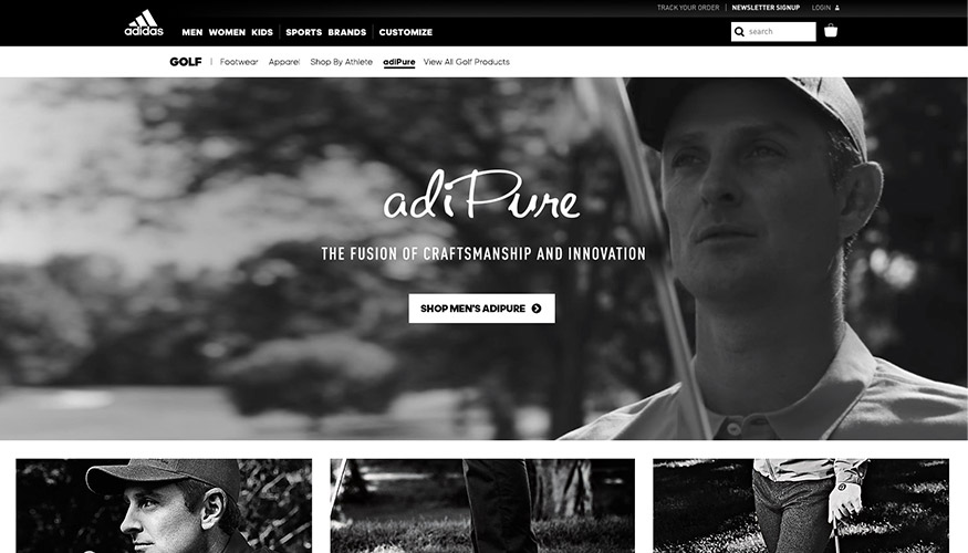
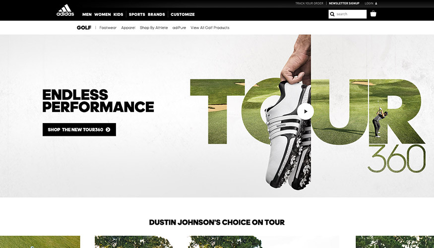
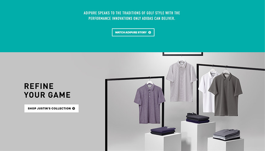

View More
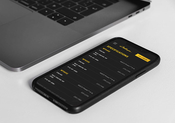
AGCO Challenger Website RedesignUI/UX, Website
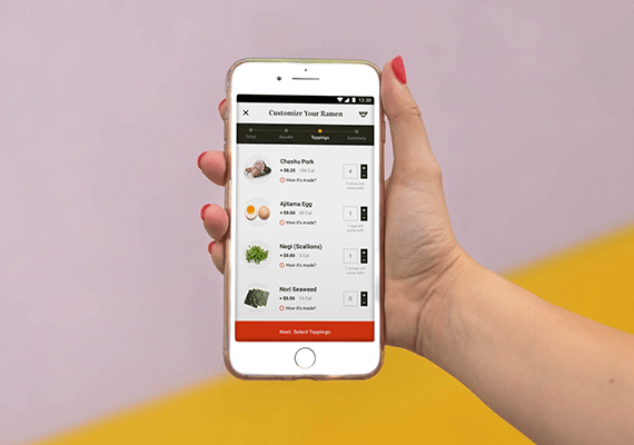
Adobe Live Ramen Ticketing AppUI/UX, Mobile App
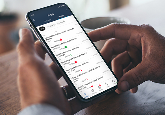
ICE MobileMobile UI/UX Design

Employee Training PortalUI/UX, Educational Tool

UC San Diego Break Things Better CampaignUI/UX, Campaign Microsite
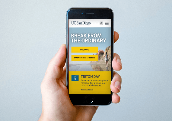
UC San Diego Main Website RedesignUI/UX, Website
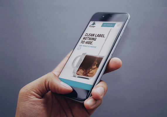
Caribou Coffee Clean Label CampaignUI/UX, Campaign Landing Page