
Break Things Better
UC San Diego is a different kind of university, a community of breakers and makers that believe in challenging the status quo & breaking the rules - all in the service of making the world a better place through discovery, invention and unconventional thinking.
With a launch of paid the media campaign targeting a broad audience to inspire top-caliber students to select UC San Diego as their No 1 pick, we were tasked to create an engaging, incentivizing and educational story hub campaign destination.
-ROLE
Art Direction
Design
UX
Front-end Direction
-YEAR
2016
Visit Website
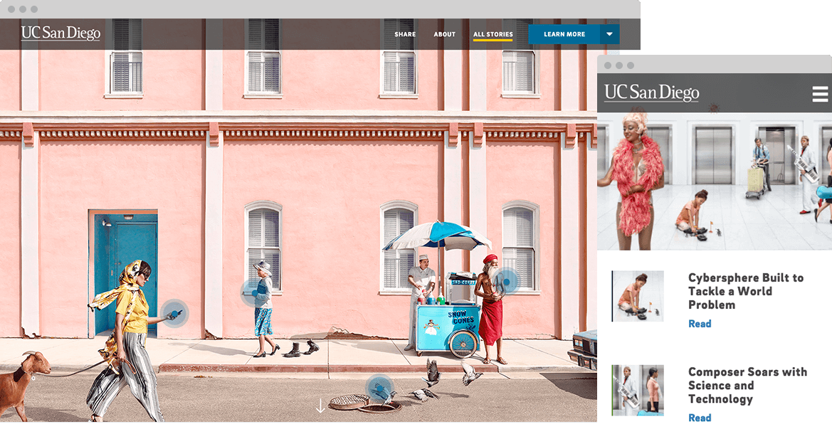
UX/UI approach
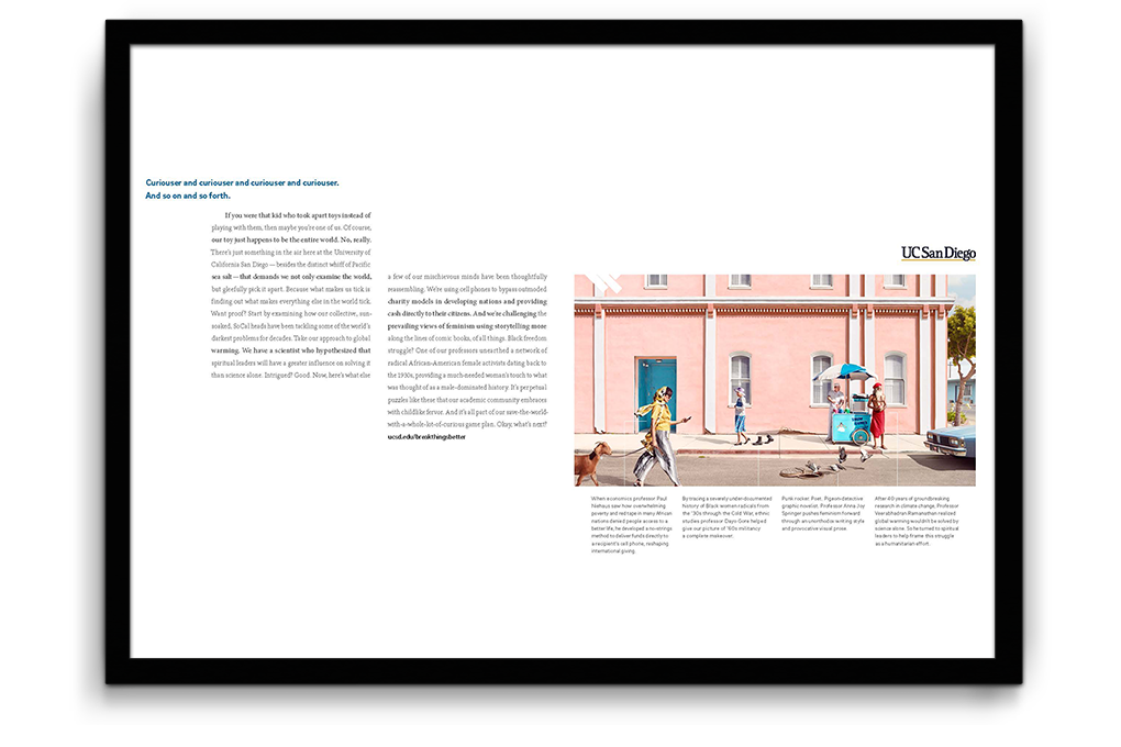
Our traditional media creative execution had an easter egg hunting-esque approach so my goal was to maintain similar experience throughout a variety of campaign platforms, while making our landing page experience more dynamic and high conversion in mind.
PRINT AD
WIREFRAMES + DESIGNS
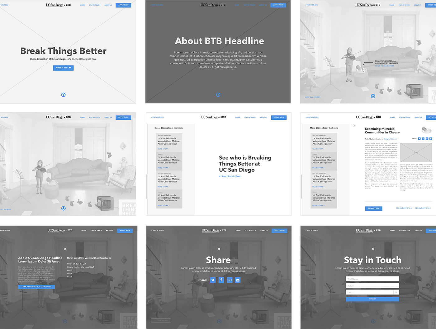
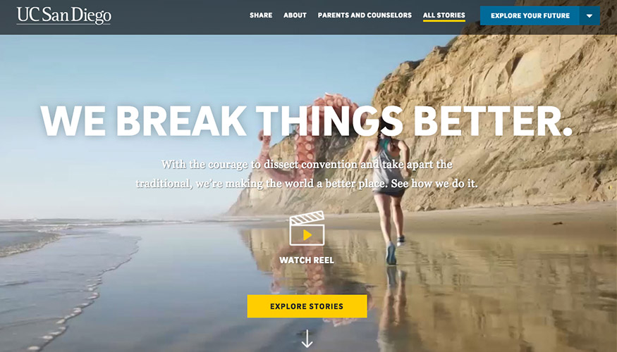
Providing clear CTA to lead users to explore storied. Top right CTA will change throughout the season to accommodate recruiting needs (ex: Apply Now, Check Your Application Status, Explore Your Future).
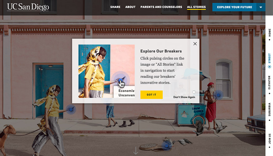
Providing an instructional modal so then users don't have to figure out the functionality by themselves. Cache is added so this appears only the first time of arrival.
Each hotspot is associated with a UC San Diego’s unique story. Upon hover, it reveals the story headline and suggests users to click to read.
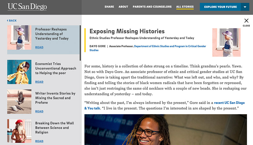
Story detail page. Users can browse other stories on the left rail. Providing multiple cross-linking opportunities for user to explore more information about schools and programs.
Story detail page. Users can browse other stories on the left rail. Providing multiple cross-linking opportunities for user to explore more information about schools and programs.
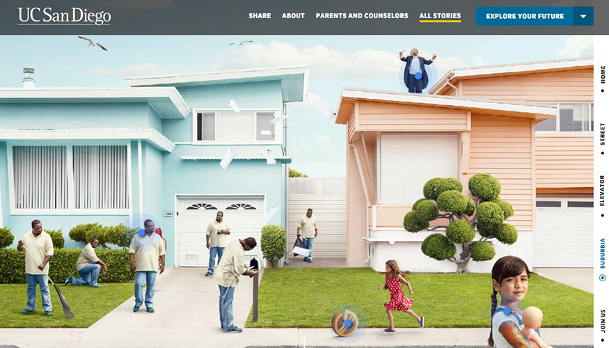
Additional story scenes.
Numbers don’t lie. Providing significant stats to communicate how advanced this university is to top-caliber students.
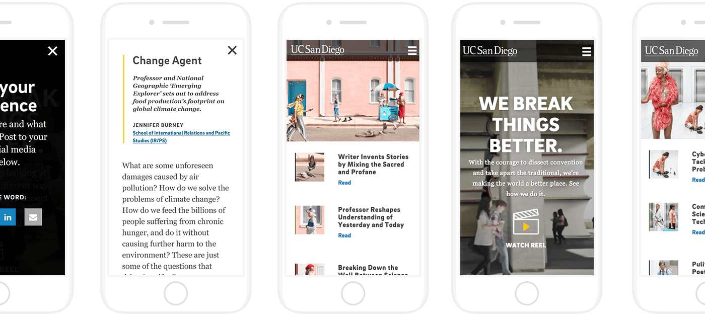
Mobile version of the site is highly optimized for mobile-specific experience. The experienced is highly focused on making stories browsable.
Results and Key Metrics
acquired total pageviews
Average time spend on time across the device
traffic interacted with key CTAs on navigation
video view from homepage
View More
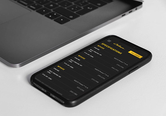
AGCO Challenger Website RedesignUI/UX, Website
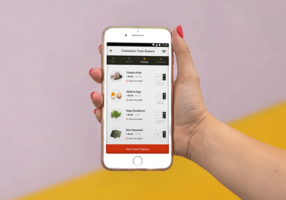
Adobe Live Ramen Ticketing AppUI/UX, Mobile App
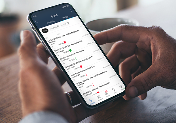
ICE MobileMobile UI/UX Design
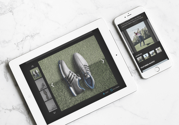
Employee Training PortalUI/UX, Educational Tool
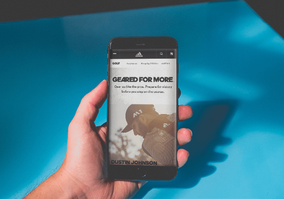
adidas.com MigrationUI/UX, Website Migration
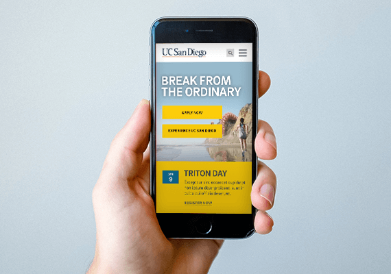
UC San Diego Main Website RedesignUI/UX, Website
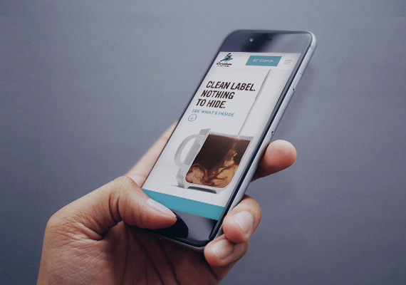
Caribou Coffee Clean Label CampaignUI/UX, Campaign Landing Page